---
title: "Data viz (Notes)"
format:
html:
toc: true
toc-depth: 2
embed-resources: true
---
```{r include = FALSE}
# This chunk just sets up some styling (eg: default size of our images)
knitr::opts_chunk$set(
collapse = TRUE,
warning = FALSE,
message = FALSE,
fig.height = 2.75,
fig.width = 4.25,
fig.align = 'center')
```
# Background
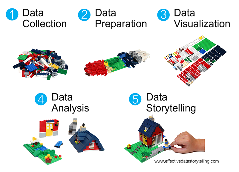
We're starting our unit on **data visualization** or **data viz**, thus skipping some steps in the data science workflow.
Mainly, it's tough to understand how our data should be *prepared* before we have a sense of what we want to *do* with this data!
{width="50%"}
[Source](https://www.effectivedatastorytelling.com/post/a-deeper-dive-into-lego-bricks-and-data-stories)
\
\
\
::: {.callout-note title="Learning goals"}
Warm-up (together)
- Convince ourselves about the importance of data viz.
- Explore the "grammar of graphics".
Exercises (in groups)
- Explore how to create data viz in RStudio.
- Understand the different basic univariate visualizations for categorical and quantitative variables.
:::
\
\
\
\
::: {.callout-note title="Additional resources"}
Watch:
- [Intro to ggplot](https://www.youtube.com/watch?v=0OtY38LVy-o&list=PLyEH7o09I467e8zck95awweg_bGuLzqjz&index=6) (Lisa Lendway)
- [Univariate viz (interpreting)](https://www.youtube.com/watch?v=7zQmWTT_m-Y) (Alicia Johnson) -- you can ignore the parts about numerical summaries.
Read:
- [A grammar for data graphics](https://mdsr-book.github.io/mdsr2e/ch-vizII.html) (Baumer, Kaplan, & Horton)
- [Data visualization](https://r4ds.hadley.nz/data-visualize.html) (Wickham, Çetinkaya-Rundel, & Grolemund)
- [Visualizing distributions](https://clauswilke.com/dataviz/histograms-density-plots.html) (Wilke)
- [ggplot cheat sheet](https://raw.githubusercontent.com/rstudio/cheatsheets/main/data-visualization.pdf)
:::
\
\
\
\
# Warm-up
## The importance of visualizations {.unnumbered}
**EXAMPLE 1**
We'll look at data on hiking trails in the 46 "high peaks" in the Adirondack mountains of northern New York state. This includes data on the hike's highest `elevation` (feet), vertical `ascent` (feet), `length` (miles), `time` in hours that it takes to complete, and difficulty `rating`.
hikes <- read.csv("https://mac-stat.github.io/data/high_peaks.csv")
1. Insert a code chunk in one of 2 ways:
- Click the green code chunk button and select "R".
- Use a keyboard shortcut!
- Ctrl + Alt + I (Windows and Linux)
- Command + Option + I (Mac)
2. Cut and paste the `hikes <- read.csv(...)` code into your code chunk.
3. Add a comment above the `read.csv()` line describing what the code is doing.
4. Run the code in the chunk in one of two ways:
- Click the green play button in the top right of the chunk.
- Use a keyboard shortcut!
- Ctrl + Shift + Enter (Windows and Linux)
- Command + Shift + Enter (Mac)
5. Open this data in a viewer in one of 3 ways:
- Click `hikes` in the Environment tab.
- Enter `View(hikes)` in the *console*.
- (NEW!) Ctrl+click (Windows) or Command+click (Mac)
As you look through the data in the viewer, try and answer the questions below. How easy is this? Type your reaction using one BOLD word and one ITALICIZED word.
- What patterns and trends are there in hiking trail `elevation`?
- What is the relationship between a hike's `elevation` and the typical `time` it takes to summit / reach the top?
\
\
\
\
**EXAMPLE 2**
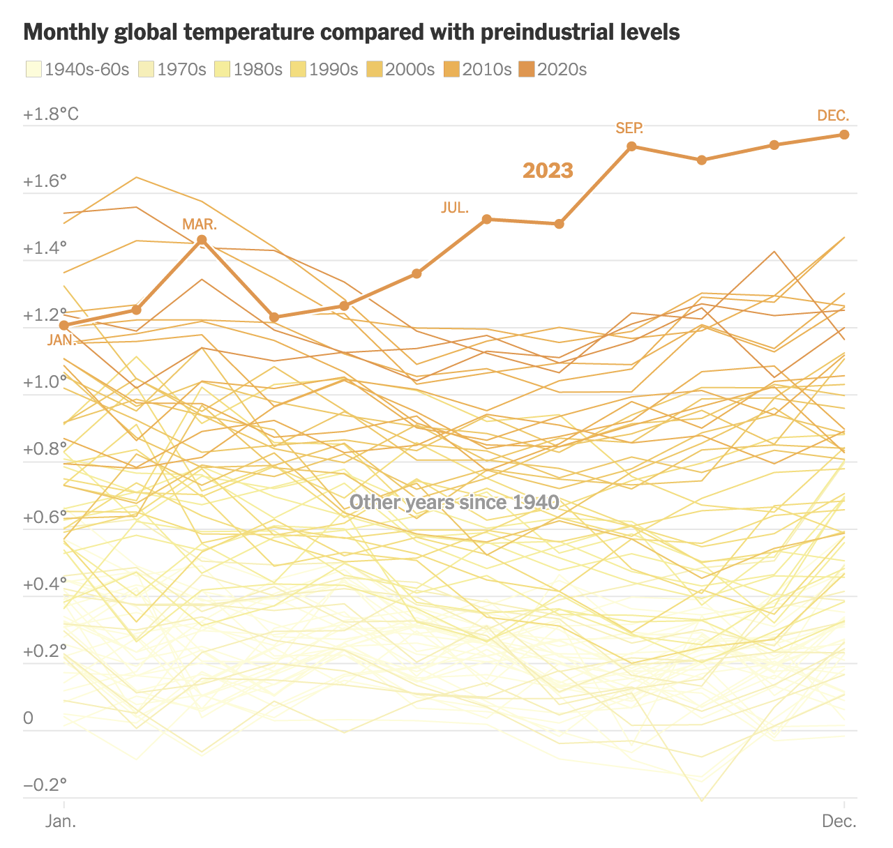
What if this [New York Times article](https://www.nytimes.com/2024/01/09/climate/2023-warmest-year-record.html) tried telling this story *without* using data viz? What would that story be like?
**Group exercise:** Collaborate with your group to brainstorm a paragraph that could try to take the place of this data visualization. (Feel free to talk it out or type it.)
\
\
\
\
**Benefits of visualization**
- Gain and communicate understanding with just a glance:
- scales & typical outcomes
- outliers (unusual cases)
- patterns & relationships
- Refine research questions & inform next steps of our analysis.
- Communicate our findings and tell a story.
\
\
\
\
## Components of data graphics {.unnumbered}
**EXAMPLE 3**
Data viz is the process of *mapping* data to different plot components. For example, in the NYT example above, the research team *mapped* data like the following (but with many more rows!) to the plot:
| observation | decade | year | date | relative temp |
|:------------|:-------:|:----:|:----:|:-------------:|
| 1 | 2020-30 | 2023 | 1/23 | 1.2 |
| 2 | 1940-60 | 1945 | 3/45 | -0.05 |
**Group exercise:** Write down step-by-step directions to use a data table like this one to create the temperature visualization. A computer is your audience. Thus be as precise as possible, but trust that the computer can find the exact numbers if you tell it where.
\
\
\
\
**COMPONENTS OF GRAPHICS**
In data viz, we essentially start with a blank canvas and then map data onto it. There are multiple possible *mapping components*. Some basics from [Wickham](https://ggplot2-book.org/introduction) (which goes into more depth):
- **a frame, or coordinate system**\
The variables or features that define the axes and gridlines of the canvas.\
NYT example: x-axis = date, y-axis = temp
- **a layer**\
The geometric elements (e.g. lines, points) we add to the canvas to represent either the data points themselves or patterns among the data points. Each type of geometric element is a separate layer. These geometric elements are sometimes called "geoms" or "glyphs" (like *heiroglyph*!)\
NYT example: add one line per year, add dots for each month in 2023
- **scales**\
The aesthetics we might add to geometric elements (e.g. color, size, shape) to incorporate additional information about data scales or groups.\
NYT example: color each line by decade
- **faceting**\
The splitting up of the data into multiple subplots, or facets, to examine different groups within the data.\
NYT example: none
- **a theme**\
Additional controls on the "finer points" of the plot aesthetics, (e.g. font type, background, color scheme).\
NYT example: NYT style
\
\
\
\
## ggplot + R packages {.unnumbered}
We will use the powerful `ggplot` tools in RStudio to build (most of) our viz. The `gg` here is short for the **"grammar of graphics"**. These tools are developed in a way that:
- recognizes that code is communication (it has a grammar!)
- connects code to the components / philosophy of data viz
\
\
**EXAMPLE: ggplot in the news**
- [former MPR journalist David Montgomery](http://dhmontgomery.com/portfolio/): [R data viz](https://github.com/dhmontgomery/personal-work/tree/master/theme-mpr)
- [BBC R data viz](https://bbc.github.io/rcookbook/)
\
\
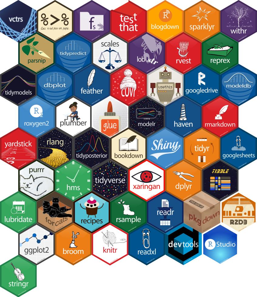
To use these tools, we must first get them into R/RStudio! Recall that R is *open source*. Anybody can build R tools and share them through special R **packages**. The **tidyverse package** compiles a set of individual packages, including `ggplot2`, that share a common grammar and structure. Though the learning curve can be steep, this grammar is intuitive and generalizable once mastered. Image source: [Posit BBC on X](https://twitter.com/posit_pbc/status/1145592633823244289)
{width="50%"}
Follow the directions below to *install* this package, the directions depending upon whether or not you're working on Mac's server. Unless the authors of a package add updates, you only need to do this once all semester. To install:
- **If you're working on Mac's RStudio server**\
`tidyverse` is already installed on the server! Check this 2 ways.
- Type `library(tidyverse)` in your console. If you don't get an error, it's installed!
- Check that it appears in the list under the "Packages" tab (bottom right pane).
- **If you're working with a desktop version of R/RStudio**\
In the "Packages" tab (bottom right pane), click "Install". From there type the name of the package (`tidyverse`), make sure the "Install dependencies" box is checked, and click "Install".
- **Note:** Another way to install packages is to use the `install.packages()` function in the *Console*. Here you would enter: `install.packages("tidyverse")`
\
\
\
\
# Exercises
**Goals**
We'll talk more later about "good" data viz, and steps to think about when building viz. In these exercises, the goal is to:
- Familiarize yourself with the `ggplot()` structure and grammar.
- Build *univariate* viz, i.e. viz for 1 variable at a time.
- Start recognizing the different approaches for visualizing categorical vs quantitative variables.
\
\
**Directions**
- General
- Be kind to yourself.
- Collaborate with and be kind to others. You are expected to work together as a group.
- Ask questions. Remember that we won't discuss these exercises as a class.
- Activity specific
- The best way to learn `ggplot` is to just play around. Focus on the *patterns* and *potential* of the code. Don't worry about memorizing anything yet! You will naturally start to remember the most important / common code the more and more you use it.
\
\
## Exercise 1: Research questions {.unnumbered}
Let's explore data from a transportation survey conducted by Macalester's Sustainability Office in 2023. The aim of the survey was to understand patterns in transportation choices to and from campus.
A codebook (data description) is available [here](https://mac-stat.github.io/data/mac_transport_survey_2023_codebook.html)--have this open for reference throughout the exercises.
We'll focus on exploring respondents' primary mode of transportation (`primary_mode_choice`) and 1-way distance to campus (`dist_1way_miles`).
```{r}
transport <- read.csv("https://mac-stat.github.io/data/mac_transport_survey_2023_clean.csv")
head(transport)
```
a. What features would we like a visualization of the *categorical* difficulty `primary_mode_choice` variable to capture?
b. What about a visualization of the *quantitative* `dist_1way_miles` variable?
\
\
## Exercise 2: Load tidyverse {.unnumbered}
We'll address the above questions using `ggplot` tools. Try running the following chunk and simply take note of the error message -- this is one you'll get a lot!
```{r eval=FALSE}
# Use the ggplot function
ggplot(transport, aes(x = primary_mode_choice))
```
In order to use `ggplot` tools, we have to first *load* the `tidyverse` package in which they live. Mainly, we've *installed* the package but need to tell R when we want to *use* it. Run the chunk below to load the library. You'll need to do this within any .qmd file that uses `ggplot()`.
```{r message=FALSE}
# Load the package
library(tidyverse)
```
\
\
\
\
## Exercise 3: Bar chart of transportation modes (part 1) {.unnumbered}
Consider some specific research questions about `primary_mode_choice`:
How many responses fall into each category? Are the responses evenly distributed among these categories, or are some more common than others?
All of these questions can be answered with a **bar chart** of the **categorical** data in the `primary_mode_choice` column. First, set up the plotting **frame**:
```{r}
ggplot(transport, aes(x = primary_mode_choice))
```
Think about:
- What did this do? What do you observe?
- What, in general, is the first argument of the `ggplot()` function?
- What is the purpose of writing `x = primary_mode_choice`?
- What do you think `aes` stands for? (Might not be obvious--see solutions if you're unsure!)
\
\
\
\
## Exercise 4: Bar chart of transportation modes (part 2) {.unnumbered}
Now let's add a **geometric layer** to the frame / canvas, and start customizing the plot's **theme**. To this end, try each chunk below, *one by one*. In each chunk, make a comment about how both the code and the corresponding plot both changed.
NOTE:
- Pay attention to the general code properties and structure, not memorization.
- Not all of these are "good" plots. We're just exploring `ggplot`.
```{r}
# COMMENT on the change in the code and the corresponding change in the plot
ggplot(transport, aes(x = primary_mode_choice)) +
geom_bar()
```
```{r}
# COMMENT on the change in the code and the corresponding change in the plot
ggplot(transport, aes(x = primary_mode_choice)) +
geom_bar() +
labs(x = "Transportation mode", y = "Number of responses")
```
```{r}
# COMMENT on the change in the code and the corresponding change in the plot
ggplot(transport, aes(x = primary_mode_choice)) +
geom_bar(fill = "blue") +
labs(x = "Transportation mode", y = "Number of responses")
```
```{r}
# COMMENT on the change in the code and the corresponding change in the plot
ggplot(transport, aes(x = primary_mode_choice)) +
geom_bar(color = "orange", fill = "blue") +
labs(x = "Transportation mode", y = "Number of responses")
```
```{r}
# COMMENT on the change in the code and the corresponding change in the plot
ggplot(transport, aes(x = primary_mode_choice)) +
geom_bar(color = "orange", fill = "blue") +
labs(x = "Transportation mode", y = "Number of responses") +
theme_minimal()
```
\
\
\
\
## Exercise 5: Bar chart follow-up {.unnumbered}
### Part a {.unnumbered}
Reflect on the `ggplot()` code.
- What's the purpose of the `+`? When do we use it?
- We added the bars using `geom_bar()`? Why "geom"?
- What does `labs()` stand for?
- What's the difference between `color` and `fill`?
### Part b {.unnumbered}
In general, bar charts allow us to examine the following properties of a *categorical* variable:
- **observed categories**: What categories did we observe?
- **variability between categories**: Are observations evenly spread out among the categories, or are some categories more common than others?
We must then *translate* this information into the *context* of our analysis, here transportation choices at Mac. Summarize here what you learned from the bar chart, in context.
### Part c {.unnumbered}
Is there anything you don't like about this barplot? For example: check out the x-axis again.
\
\
\
\
## Exercise 6: Sad bar chart {.unnumbered}
Let's now consider some research questions related to the *quantitative* `dist_1way_miles` variable:
Among the responses, what's the *range* of distances to campus and how are the responses *distributed* within this range (e.g. evenly, in clumps, "normally")? What's a *typical* distance to campus? Are there any *outliers*, i.e. responses that have unusually high or low?
Here:
- Construct a **bar chart** of the *quantitative* `dist_1way_miles` variable.
- Explain why this is *not* an effective visualization for this and other quantitative variables. (What questions does / doesn't it help answer?)
```{r}
```
\
\
\
\
## Exercise 7: Histograms {.unnumbered}
Quantitative variables require different viz than categorical variables. Especially when the quantitative variable has many possible outcomes, it's typically ineffective to simply count up the number of times we've observed a particular outcome (as the bar graph did above). It gives us a sense of ranges and typical outcomes, but not a good sense of how the observations are distributed across this range. We'll explore two methods for graphing quantitative variables: histograms and density plots.
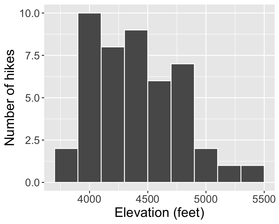
**Histograms** are constructed by (1) dividing up the observed range of the variable into 'bins' of equal width; and (2) counting up the number of cases that fall into each bin. Check out the example below from a different dataset on hikes in the Adirondack Mountains:
{width="50%"}
### Part a {.unnumbered}
Let's dig into some details.
- How many hikes have an elevation between 4500 and 4700 feet?
- How many total hikes have an elevation of at least 5100 feet?
### Part b {.unnumbered}
Now the bigger picture. In general, histograms allow us to examine the following properties of a *quantitative* variable:
- **typical outcome:** Where’s the center of the data points? What's typical?
- **variability & range:** How spread out are the outcomes? What are the max and min outcomes?
- **shape:** How are values distributed along the observed range? Is the distribution symmetric, right-skewed, left-skewed, bi-modal, or uniform (flat)?
- **outliers:** Are there any outliers, i.e. outcomes that are unusually large/small?
We must then *translate* this information into the *context* of our analysis, here hikes in the Adirondack Mountains. Addressing each of the features in the above list, summarize here what you learned from the histogram, in context.
\
\
\
\
## Exercise 8: Building histograms (part 1) {.unnumbered}
2-MINUTE CHALLENGE: Thinking of the bar chart code, try to *intuit* what line you can tack on to the below frame of `elevation` to add a histogram layer. Don't forget a `+`. If it doesn't come to you within 2 minutes, *no problem* -- all will be revealed in the next exercise.
```{r}
ggplot(transport, aes(x = dist_1way_miles))
```
\
\
\
\
## Exercise 9: Building histograms (part 2) {.unnumbered}
Let's build some histograms. Try each chunk below, *one by one*. In each chunk, make a comment about how both the code and the corresponding plot both changed.
```{r}
# COMMENT on the change in the code and the corresponding change in the plot
ggplot(transport, aes(x = dist_1way_miles)) +
geom_histogram()
```
```{r}
# COMMENT on the change in the code and the corresponding change in the plot
ggplot(transport, aes(x = dist_1way_miles)) +
geom_histogram(color = "white")
```
```{r}
# COMMENT on the change in the code and the corresponding change in the plot
ggplot(transport, aes(x = dist_1way_miles)) +
geom_histogram(color = "white", fill = "blue")
```
```{r}
# COMMENT on the change in the code and the corresponding change in the plot
ggplot(transport, aes(x = dist_1way_miles)) +
geom_histogram(color = "white") +
labs(x = "1-way distance to Mac (miles)", y = "Number of responses")
```
```{r}
# COMMENT on the change in the code and the corresponding change in the plot
ggplot(transport, aes(x = dist_1way_miles)) +
geom_histogram(color = "white", binwidth = 40) +
labs(x = "1-way distance to Mac (miles)", y = "Number of responses")
```
```{r}
# COMMENT on the change in the code and the corresponding change in the plot
ggplot(transport, aes(x = dist_1way_miles)) +
geom_histogram(color = "white", binwidth = 0.5) +
labs(x = "1-way distance to Mac (miles)", y = "Number of responses")
```
```{r}
# COMMENT on the change in the code and the corresponding change in the plot
ggplot(transport, aes(x = dist_1way_miles)) +
geom_histogram(color = "white", binwidth = 5) +
labs(x = "1-way distance to Mac (miles)", y = "Number of responses")
```
\
\
\
\
## Exercise 10: Histogram follow-up {.unnumbered}
- What function added the histogram layer / geometry?
- What's the difference between `color` and `fill`?
- Why does adding `color = "white"` improve the visualization?
- What did `binwidth` do?
- Why does the histogram become ineffective if the `binwidth` is too big (e.g. 40 miles)?
- Why does the histogram become ineffective if the `binwidth` is too small (e.g. 0.5 miles)?
\
\
\
\
## Exercise 11: Density plots {.unnumbered}
**Density plots** are essentially smooth versions of the histogram. Instead of sorting observations into discrete bins, the "density" of observations is calculated across the entire range of outcomes. The greater the number of observations, the greater the density! The density is then scaled so that the area under the density curve **always equals 1** and the area under any fraction of the curve represents the fraction of cases that lie in that range.
Check out a density plot of 1-way distance to campus Note that the y-axis (density) has no contextual interpretation -- it's a relative measure. The *higher* the density, the more *common* are distances in that range.
```{r}
ggplot(transport, aes(x = dist_1way_miles)) +
geom_density()
```
**Questions**
- INTUITION CHECK: Before tweaking the code and thinking back to `geom_bar()` and `geom_histogram()`, how do you *anticipate* the following code will change the plot?
- `geom_density(color = "blue")`
- `geom_density(fill = "orange")`
- TRY IT! Test out those lines in the chunk below. Was your intuition correct?
```{r}
```
- Examine the density plot. How does it compare to the histogram? What does it tell you about the *typical* commute distances, *variability / range* in distances, and *shape* of the distribution of distances within this range?
\
\
\
\
## Exercise 12: Density plots vs histograms {.unnumbered}
The histogram and density plot both allow us to visualize the behavior of a quantitative variable: typical outcome, variability / range, shape, and outliers. What are the pros/cons of each? What do you like/not like about each?
\
\
\
\
## Exercise 13: Code = communication {.unnumbered}
We *obviously* won't be done until we talk about communication. All code above has a similar *general* structure (where the details can change):
```{r eval=FALSE}
ggplot(___, aes(x = ___)) +
geom___(color = "___", fill = "___") +
labs(x = "___", y = "___")
```
- Though not *necessary* to the code working, it's common, good practice to *indent* or *tab* the lines of code after the first line (counterexample below). Why?
```{r}
# YUCK
ggplot(transport, aes(x = dist_1way_miles)) +
geom_histogram(color = "white", binwidth = 5) +
labs(x = "1-way distance to Mac (miles)", y = "Number of responses")
```
- Though not *necessary* to the code working, it's common, good practice to put a *line break* after each `+` (counterexample below). Why?
```{r}
# YUCK
ggplot(transport, aes(x = dist_1way_miles)) + geom_histogram(color = "white", binwidth = 5) + labs(x = "1-way distance to Mac (miles)", y = "Number of responses")
```
\
\
\
\
## Exercise 14: Practice {.unnumbered}
### Part a {.unnumbered}
Practice your viz skills to learn about some of the variables in one of the following datasets from the previous class:
```{r}
# Data on students in this class
survey <- read.csv("https://mac-stat.github.io/data/112_spring_2026_survey.csv")
# World Cup data
world_cup <- read.csv("https://raw.githubusercontent.com/rfordatascience/tidytuesday/master/data/2022/2022-11-29/worldcups.csv")
```
### Part b {.unnumbered}
Check out the [RStudio Data Visualization cheat sheet](https://raw.githubusercontent.com/rstudio/cheatsheets/main/data-visualization.pdf) to learn more features of `ggplot`.
\
\
\
\
\
\
\
\