---
title: "Spatial Viz (Notes)"
format:
html:
toc: true
toc-depth: 2
embed-resources: true
---
```{r include = FALSE}
# This chunk just sets up some styling (eg: default size of our images)
knitr::opts_chunk$set(
collapse = TRUE,
warning = FALSE,
message = FALSE,
fig.height = 2.75,
fig.width = 4.25,
fig.align = 'center')
```
::: {.callout-note title="Learning goals"}
- Plot data points on top of a map (`ggplot()`).
- Create choropleth maps (`geom_map()`).
- Understand the basics of creating a map using `leaflet`, including adding points and choropleths to a base map.
:::
\
\
\
\
::: {.callout-note title="Additional resources"}
Watch:
- [Creating maps with leaflet](https://www.youtube.com/embed/w5U62wUki3E) (Lisa Lendway)
- [More leaflet](https://www.youtube.com/embed/U07OQ3V-W2k) (Lisa Lendway)
Read:
- [Spatial data visualization (Chp 17, intro and 17.1)](https://mdsr-book.github.io/mdsr2e/ch-spatial.html) (Baumer et al)
- [Detailed leaflet documenation](https://rstudio.github.io/leaflet/)
- [leaflet cheat sheet](https://ugoproto.github.io/ugo_r_doc/pdf/leaflet-cheat-sheet.pdf)
- [Provider map previews](http://leaflet-extras.github.io/leaflet-providers/preview/)
- [Tutorial](https://learn.r-journalism.com/en/mapping/census_maps/census-maps/) by Andrew Ba Tran, investigative data reporter at Washington Post
- For more advanced work with spatial mapping, GIS in R, etc. see the [sf package](https://r-spatial.github.io/sf/).
:::
\
\
\
\
## Review
In the previous activity, we explored state-level SAT data to practice visualization with 3+ variables and to discover an important statistical idea. Let's recap that together.
```{r}
library(tidyverse)
# Import and check out data
education <- read.csv("https://mac-stat.github.io/data/sat.csv")
head(education)
dim(education)
```
We used **scatterplots** to explore how SAT scores related to spending per student and to teacher salaries:
```{r}
# SAT scores vs. average expenditures per student
ggplot(education, aes(y = sat, x = expend)) +
geom_point() +
geom_smooth(method = "lm")
# SAT scores vs. average teacher salary
ggplot(education, aes(y = sat, x = salary)) +
geom_point() +
geom_smooth(method = "lm")
```
Seemingly:
- States with higher spending on education...
- tend to have lower average SAT scores.
This seems unexpected!
\
However, we could use our curiosity combined with augmented plots to explore what might be happening.
We explored a third variable: the fraction of students in the state that took the SAT (`fracCat`). This variable had a clear relationship with average SAT scores:
```{r}
ggplot(education, aes(x = sat, fill = fracCat)) +
geom_density(alpha = 0.5)
ggplot(education, aes(y = sat, x = fracCat, fill = fracCat)) +
geom_violin(alpha = 0.5)
```
```{r}
ggplot(education, aes(y = sat, x = expend, color = fracCat)) +
geom_point() +
geom_smooth(method = "lm")
```
Our paradoxical finding was explained by a *confounding* or *omitted* or *lurking* variable: the % of students in a state that take the SAT:
- States with higher spending...
- tend to have a higher % of students of students that take the SAT...
- which then "leads to" lower average SAT scores.
Thus, *when controlling for the % of students that take the SAT*, more spending is correlated with higher scores.
This is an example of a statistical phenomenon known as **Simpson's Paradox**. This topic is covered more in:
- STAT 155: Introduction to Statistical Modeling
- STAT 451: Causal Inference
----------
Let's explore a Simpson's paradox related to Mac!
Back in the 2000s, Macalester invested in insulating a few campus-owned houses, with the hopes of leading to energy savings. Former Mac prof Danny Kaplan accessed monthly data on energy use and other info for these addresses, before and after renovations:
```{r}
# Load tidyverse package for plotting and wrangling
library(tidyverse)
# Import the data and only keep 2 addresses
energy <- read.csv("https://mac-stat.github.io/data/MacNaturalGas.csv") %>%
mutate(date = as.Date(paste0(month, "/1/", year), "%m/%d/%Y")) %>%
filter(address != "c")
# Check it out
head(energy)
```
Included are the following variables:
| variable | meaning |
|:------------|:----------------------------------------------------------|
| therms | a measure of energy use (the more energy used, the larger the therms) |
| address | a or b |
| renovated | whether the location had been renovated, yes or no |
| month | from 1 to 12 |
| hdd | monthly heating degree days. a proxy measure of outside temperatures (the higher the hdd, the COLDER it was) |
\
\
\
\
**Directions:** Construct a plot that addresses each research question. Include a 1-sentence summary of the plot.
\
\
\
\
**EXAMPLE 1**
What was range in, and typical, energy used each month, as measured by `therms`? How does this differ by address?
```{r}
```
\
\
\
\
**EXAMPLE 2**
How did energy use (`therms`) change over time (`date`) at the two addresses?
```{r}
```
\
\
\
\
**EXAMPLE 3**
How did the typical energy use (`therms`) at the two addresses change before and after they were `renovated`?
```{r}
```
\
\
\
\
**EXAMPLE 4**
That seems unfortunate that energy usage went *up* after renovations. But also fishy.
Take 5 minutes in your groups to try and explain what's going on here. Think: What *confounding*, *lurking*, or *omitted* variable related to energy usage are we ignoring here? Try to make some plots to prove your point.
```{r}
```
\
\
\
\
**EXAMPLE 5**
Let's summarize the punchlines by filling in the ???. It seemed that:
- After renovation...
- energy use increased.
BUT this was explained by a *confounding* or *omitted* or *lurking* variable: ???
- After renovation...
- ???...
- which then leads to higher energy use.
Thus, *when controlling for* ???, renovations led to *decreased* energy use.
\
\
\
\
## New stuff
**Types of spatial viz**
- **point maps**: plotting locations of *individual observations*\
Example 1: [bigfoot sightings](https://experience.arcgis.com/experience/9cc90686aa164853a1355f310f66ede0)\
Example 2: [Little Free Libraries around Austin, TX](https://do512family.com/little-free-libraries-around-austin/)
{fig-align="center" width=4.25in fig-alt="Map view of Austin, TX with red markers for Free Little Library locations"}
- **contour maps**: plotting the *density* or distribution of observations (not the individual observations themselves)
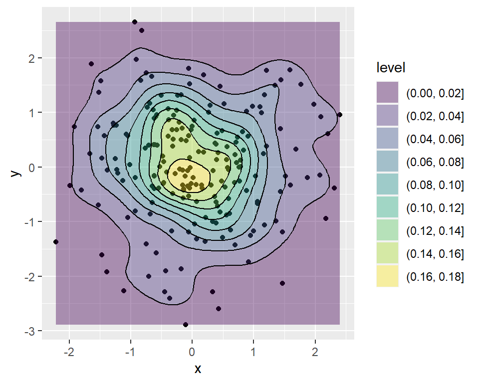{fig-align="center" width=4.25in fig-alt="Scatterplot with contour lines and shading indicating regions of densely clustered to sparse areas of points"}
- **choropleth maps**: plotting outcomes in different *regions*
- [NYT article on effects of redlining](https://www.nytimes.com/interactive/2020/08/24/climate/racism-redlining-cities-global-warming.html)
- [Minnesota Reformer article on how Mpls / St Paul voted on 2021 ballot measures related to mayoral, policing, and rent policies](https://minnesotareformer.com/2021/11/04/maps-how-minneapolis-voted-on-key-ballot-questions/)
- **dynamic maps**: interactive maps, either point, choropleth, or contour
\
\
\
\
## Exercise preview
You'll explore some R spatial viz tools below. In general, there are two important pieces to every map:
**Piece 1: A dataset**
This dataset must include either:
- location coordinates for your points of interest (for point maps); or
- variable outcomes for your regions of interest (for choropleth maps)
\
**Piece 2: A background map**
We need latitude and longitude coordinates to specify the boundaries for your regions of interest (eg: countries, states). This is where it gets really sticky!
- County-level, state-level, country-level, continent-level info live in multiple places.
- Where we grab this info *can* depend upon whether we want to make a point map or a choropleth map. (The background maps can be used somewhat interchangeably, but it requires extra code :/)
- Where we grab this info can also depend upon the structure of our data and how much data wrangling / cleaning we're up for. For choropleth maps, the labels of regions in our data must match those in the background map. For example, if our data labels states with their abbreviations (eg: MN) and the background map refers to them as full names in lower case (eg: minnesota), we have to wrangle our data so that it matches the background map.
In short, the code for spatial viz gets very specialized. The goal of these exercises is to:
- play around and experience the wide variety of spatial viz tools out there
- understand the difference between point maps and choropleth maps
- have fun
You can skip around as you wish and it's totally fine if you don't finish everything. Just come back at some point to play around.
\
\
\
\
## Exercises Part 1: Interactive points on a map with `leaflet`
[Leaflet](https://leafletjs.com/) is an open-source JavaScript library for creating maps. We can use it inside R through the `leaflet` package.
This uses a different plotting framework than `ggplot2`, but still has a `tidyverse` feel (which will become more clear as we learn other tidyverse tools!).
The general steps are as follows:
1. Create a *map widget* by calling `leaflet()` and telling it the data to use.
2. Add a *base map* using `addTiles()` (the default) or `addProviderTiles()`.
3. Add *layers* to the map using layer functions (e.g. `addMarkers()`, `addPolygons()`).
4. Print the map widget to *display* it.
\
\
\
\
### Exercise 1: A leaflet with markers / points {.unnumbered}
Earlier this semester, we asked for the latitude and longitude of one of your favorite places. The code below does some *data wrangling* that we'll learn later in the semester--it removes data entry errors (eg: if you didn't enter the data using decimal notation) and makes the latitude and longitude columns numeric.
Let's load the data and map it!
```{r}
survey <- read.csv("https://mac-stat.github.io/data/112_spring_2026_survey.csv")
fave_places <- survey |>
select(latitude, longitude) |>
filter(!str_detect(latitude, "°"), !str_detect(longitude, "°")) |>
mutate(
latitude = str_remove_all(latitude, ","),
latitude = as.numeric(latitude),
longitude = as.numeric(longitude)
)
# Check it out
head(fave_places)
```
#### Part a {.unnumbered}
You can use a "two-finger scroll" to zoom in and out.
```{r}
# Load the leaflet package
library(leaflet)
# Just a plotting frame
leaflet(data = fave_places)
```
```{r}
# Now what do we have?
leaflet(data = fave_places) %>%
addTiles()
```
```{r}
# Now what do we have?
# longitude and latitude refer to the variables in our data
leaflet(data = fave_places) %>%
addTiles() %>%
addMarkers(lng = ~longitude, lat = ~latitude)
```
```{r}
# Since we named them "longitude" and "latitude", the function
# automatically recognizes these variables. No need to write them!
leaflet(data = fave_places) %>%
addTiles() %>%
addMarkers()
```
#### Part b {.unnumbered}
**PLAY AROUND!** This map is interactive. Zoom in on one location. Keep zooming -- what level of detail can you get into? How does that detail depend upon where you try to zoom in (thus what are the limitations of this tool)?
\
\
\
\
### Exercise 2: Details {.unnumbered}
We can change all sorts of details in leaflet maps.
```{r}
# Load package needed to change color
library(gplots)
# We can add colored circles instead of markers at each location
leaflet(data = fave_places) %>%
addTiles() %>%
addCircles(color = col2hex("red"))
```
```{r}
# We can change the background
# Mark locations with yellow dots
# And connect the dots, in their order in the dataset, with green lines
# (These green lines don't mean anything here, but would if this were somebody's travel path!)
leaflet(data = fave_places) %>%
addProviderTiles("USGS") %>%
addCircles(weight = 10, opacity = 1, color = col2hex("yellow")) %>%
addPolylines(
lng = ~longitude,
lat = ~latitude,
color = col2hex("green")
)
```
In general:
- `addProviderTiles()` changes the base map.\
To explore all available provider base maps, type `providers` in the console. (Though some don't work :/)
- Use `addMarkers()` or `addCircles()` to mark locations. Type `?addControl` into the console to pull up a help file which summarizes the aesthetics of these markers and how you can change them. For example:
- `weight` = how thick to make the lines, points, pixels
- `opacity` = transparency (like `alpha` in `ggplot2`)
- colors need to be in "hex" form. We used the `col2hex()` function from the `gplots` library to do that. Or we can map colors to a variable in our data using `colorFactor()` for categorical variables or `colorNumeric()` for quantitative variables. See more info here:
\
\
\
\
### Exercise 3: Your turn {.unnumbered}
The `starbucks` data, compiled by Danny Kaplan, contains information about every Starbucks in the world at the time the data were collected, including `Latitude` and `Longitude`:
```{r}
# Import starbucks location data
starbucks <- read.csv("https://mac-stat.github.io/data/starbucks.csv")
```
Let's focus on only those in Minnesota for now:
```{r}
# Don't worry about the syntax
starbucks_mn <- starbucks %>%
filter(Country == "US", State.Province == "MN")
```
Create a leaflet map of the Starbucks locations in Minnesota. Keep it simple -- go back to Exercise 1 for an example.
\
\
\
\
## Exercises Part 2: Static points on a map
Leaflet is very powerful and fun. But:
- It's not great when we have lots of points to map -- it takes lots of time.
- It makes good interactive maps, but we often need a static map (eg: we can print interactive maps!).
Let's explore how to make point maps with `ggplot()`, not `leaflet()`.
\
\
### Exercise 4: A simple scatterplot {.unnumbered}
Let's start with the `ggplot()` tools we already know. Construct a scatterplot of all `starbucks` locations, not just those in Minnesota, with:
- Latitude and Longitude coordinates (which goes on the y-axis?!)
- Make the points transparent (alpha = 0.2) and smaller (size = 0.2)
It's pretty cool that the plots we already know can provide some spatial context. But what *don't* you like about this plot?
```{r}
```
\
\
\
\
### Exercise 5: Adding a country-level background {.unnumbered}
Let's add a background map of *country-level* boundaries.
#### Part a {.unnumbered}
First, we can grab country-level boundaries from the `rnaturalearth` package.
```{r}
# Load the package
library(rnaturalearth)
# Get info about country boundaries across the world
# in a "sf" or simple feature format
world_boundaries <- ne_countries(returnclass = "sf")
```
In your **console**, type `world_boundaries` to check out what's stored there. Don't print it our in your Rmd -- printing it would be really messy there (even just the `head()`).
#### Part b {.unnumbered}
Run the chunks below to build up a new map.
```{r}
# What does this code produce?
# What geom are we using for the point map?
ggplot(world_boundaries) +
geom_sf()
```
```{r}
# Load package needed to change map theme
library(ggthemes)
# Add a point for each Starbucks
# NOTE: The Starbucks info is in our starbucks data, not world_boundaries
# How does this change how we use geom_point?!
ggplot(world_boundaries) +
geom_sf() +
geom_point(
data = starbucks,
aes(x = Longitude, y = Latitude),
alpha = 0.3, size = 0.2, color = "darkgreen"
) +
theme_map()
```
#### Part c {.unnumbered}
Summarize what you learned about Starbucks from this map.
\
\
\
\
### Exercise 6: Zooming in on some countries {.unnumbered}
Instead of `world_boundaries <- ne_countries(returnclass = 'sf')` we could zoom in on...
- the continent of Africa: `ne_countries(continent = 'Africa', returnclass = 'sf')`
- a set of countries: `ne_countries(country = c('france', 'united kingdom', 'germany'), returnclass = 'sf')`
- boundaries within a country: `ne_states(country = 'united states of america', returnclass = 'sf')`
Our goal here will be to map the Starbucks locations in Canada, Mexico, and the US.
#### Part a {.unnumbered}
To make this map, we again need two pieces of information.
1. Data on Starbucks for *only* Canada, Mexico, and the US, labeled as "CA", "MX", "US" in the `starbucks` data.
```{r}
# We'll learn this syntax soon! Don't worry about it now.
starbucks_cma <- starbucks %>%
filter(Country %in% c('CA', 'MX', 'US'))
```
2. A background map of state- and national-level boundaries in Canada, Mexico, and the US. This requires `ne_states()` in the `rnaturalearth` package where the countries are labeled 'canada', 'mexico', 'united states of america'.
```{r}
cma_boundaries <- ne_states(
country = c("canada", "mexico", "united states of america"),
returnclass = "sf")
```
#### Part b {.unnumbered}
Make the map!
```{r}
# Just the boundaries
ggplot(cma_boundaries) +
geom_sf()
```
```{r}
# Add the points
# And zoom in
ggplot(cma_boundaries) +
geom_sf() +
geom_point(
data = starbucks_cma,
aes(x = Longitude, y = Latitude),
alpha = 0.3,
size = 0.2,
color = "darkgreen"
) +
coord_sf(xlim = c(-179.14, -50)) +
theme_map()
```
\
\
\
\
### Exercise 7: A state and county-level map {.unnumbered}
Let's get an even *higher* resolution map of Starbucks locations within the states of Minnesota, Wisconsin, North Dakota, and South Dakota, with a background map at the county-level.
#### Part a {.unnumbered}
To make this map, we again need two pieces of information.
1. Data on Starbucks for *only* the states of interest.
```{r}
starbucks_midwest <- starbucks %>%
filter(State.Province %in% c("MN", "ND", "SD", "WI"))
```
2. A background map of state- and county-level boundaries in these states. This requires `st_as_sf()` in the `sf` package, and `map()` in the `maps` package, where the countries are labeled 'minnesota', 'north dakota', etc.
```{r}
# Load packages
library(sf)
library(maps)
# Get the boundaries
midwest_boundaries <- st_as_sf(
maps::map("county",
region = c("minnesota", "wisconsin", "north dakota", "south dakota"),
fill = TRUE, plot = FALSE))
# Check it out
head(midwest_boundaries)
```
#### Part b {.unnumbered}
Adjust the code below to make the plot! The code below has been **commented out** (made into a comment to avoid running it). To comment out/uncomment lines of code, select the lines that you want to change and then use the following keyboard shortcut:
- Ctrl + Shift + C (Windows and Linux)
- Command + Shift + C (Mac)
```{r}
# ggplot(___) +
# geom___() +
# geom___(
# data = ___,
# aes(x = ___, y = ___),
# alpha = 0.7,
# size = 0.2,
# color = 'darkgreen'
# ) +
# theme_map()
```
\
\
\
\
### Exercise 8: Contour maps {.unnumbered}
Especially when there are lots of point locations, and those locations start overlapping on a map, it can be tough to visualize areas of higher *density*. Consider the Starbucks locations in Canada, Mexico, and the US that we mapped earlier:
```{r}
# Point map (we made this earlier)
ggplot(cma_boundaries) +
geom_sf() +
geom_point(
data = starbucks_cma,
aes(x = Longitude, y = Latitude),
alpha = 0.3,
size = 0.2,
color = "darkgreen"
) +
coord_sf(xlim = c(-179.14, -50), ylim = c(14.54, 83.11)) +
theme_map()
```
Now check out the contour map.
```{r}
# What changed in the plot?
# What changed in our code?!
ggplot(cma_boundaries) +
geom_sf() +
geom_density_2d(
data = starbucks_cma,
aes(x = Longitude, y = Latitude),
size = 0.2,
color = "darkgreen"
) +
coord_sf(xlim = c(-179.14, -50), ylim = c(14.54, 83.11)) +
theme_map()
```
\
\
\
\
## Exercises Part 3: Choropleth maps
Spatial data isn't always in the form of point locations! For example, recall the state and county-level data on presidential elections.
```{r}
elections_by_state <- read.csv("https://mac-stat.github.io/data/election_2020_by_state.csv")
elections_by_counties <- read.csv("https://mac-stat.github.io/data/election_2020_county.csv")
```
In these datasets, we're interested in the overall election outcome by region (state or county), not the specific geographic location of some observation. Let's wrangle our data first. We'll focus on just a few variables of interest, and create a new variable (`repub_20_categories`) that *discretizes* the `repub_pct_20` variable into increments of 5 percentage points (for states) or 10 percentage points (for counties):
```{r}
# Don't worry about the code!
elections_by_state <- elections_by_state %>%
filter(state_abbr != "DC") %>%
select(state_name, state_abbr, repub_pct_20) %>%
mutate(repub_20_categories =
cut(repub_pct_20,
breaks = seq(30, 70, by = 5),
labels = c("30-34", "35-39", "40-44", "45-49",
"50-54", "55-59", "60-64", "65-70"),
include.lowest = TRUE))
elections_by_counties <- elections_by_counties %>%
select(state_name, state_abbr, county_name, county_fips,
repub_pct_20, median_age, median_rent) %>%
mutate(repub_20_categories =
cut(repub_pct_20,
breaks = seq(0, 100, by = 10),
labels = c("0-9", "10-19", "20-29", "30-39", "40-49",
"50-59", "60-69", "70-79", "80-89", "90-100"),
include.lowest = TRUE))
```
\
\
\
\
### Exercise 9: State-level choropleth maps {.unnumbered}
Let's map the 2020 Republican support in each *state*, `repub_pct_20`.
#### Part a {.unnumbered}
We again need two pieces of information.
1. Data on elections in each state, which we already have: `elections_by_state`.
2. A background map of state boundaries in the US. The boundaries we used for point maps don't work here. (Optional detail: they're `sf` objects and we now need a `data.frame` object.) Instead, we can use the `map_data()` function from the `ggplot2` package:
```{r}
# Get the latitude and longitude coordinates of state boundaries
states_map <- map_data("state")
# Check it out
head(states_map)
```
#### Pause {.unnumbered}
**Important detail:** Note that the `region` variable in `states_map`, and the `state_name` variable in `elections_by_state` both label states by the full name in lower case letters. This is critical to the background map and our data being able to communicate.
```{r}
head(states_map)
head(elections_by_state)
```
#### Part b {.unnumbered}
Now map `repub_pct_20` by state.
```{r}
# Note where the dataset, elections_by_state, is used
# Note where the background map, states_map, is used
ggplot(elections_by_state, aes(map_id = state_name, fill = repub_pct_20)) +
geom_map(map = states_map) +
expand_limits(x = states_map$long, y = states_map$lat) +
theme_map()
```
```{r}
# Make it nicer!
ggplot(elections_by_state, aes(map_id = state_name, fill = repub_pct_20)) +
geom_map(map = states_map) +
expand_limits(x = states_map$long, y = states_map$lat) +
theme_map() +
scale_fill_gradientn(name = "% Republican", colors = c("blue", "purple", "red"), values = scales::rescale(seq(0, 100, by = 5)))
```
It's not easy to get fine control over the color scale for the quantitative `repub_pct_20` variable. Instead, let's plot the *discretized* version, `repub_20_categories`:
```{r}
ggplot(elections_by_state, aes(map_id = state_name, fill = repub_20_categories)) +
geom_map(map = states_map) +
expand_limits(x = states_map$long, y = states_map$lat) +
theme_map()
```
```{r}
# Load package needed for refining color palette
library(RColorBrewer)
# Now fix the colors
ggplot(elections_by_state, aes(map_id = state_name, fill = repub_20_categories)) +
geom_map(map = states_map) +
expand_limits(x = states_map$long, y = states_map$lat) +
theme_map() +
scale_fill_manual(values = rev(brewer.pal(8, "RdBu")), name = "% Republican")
```
#### Part c {.unnumbered}
We can add other layers, like points, on top of a choropleth map. Add a Starbucks layer! Do you notice any relationship between Starbucks and elections? Or are we just doing things at this point? ;)
```{r}
# Get only the starbucks data from the US
starbucks_us <- starbucks %>%
filter(Country == "US")
# Map it
ggplot(elections_by_state, aes(map_id = state_name, fill = repub_20_categories)) +
geom_map(map = states_map) +
geom_point(
data = starbucks_us,
aes(x = Longitude, y = Latitude),
size = 0.05,
alpha = 0.2,
inherit.aes = FALSE
) +
expand_limits(x = states_map$long, y = states_map$lat) +
theme_map() +
scale_fill_manual(values = rev(brewer.pal(8, "RdBu")), name = "% Republican")
```
**Details (if you're curious)**
- `map_id` is a required aesthetic for `geom_map()`.
- It specifies which variable in our dataset indicates the region (here `state_name`).
- It connects this variable (`state_name`) to the `region` variable in our mapping background (`states_map`). These variables must have the same possible outcomes in order to be matched up (`alabama`, `alaska`, `arizona`,...).
- `expand_limits()` assures that the map covers the entire area it's supposed to, by pulling longitudes and latitudes from the `states_map`.
#### Part d {.unnumbered}
We used `geom_sf()` for point maps. What `geom` do we use for choropleth maps?
\
\
\
\
### Exercise 10: County-level choropleth maps {.unnumbered}
Let's map the 2020 Republican support in each *county*.
#### Part a {.unnumbered}
We again need two pieces of information.
1. Data on elections in each county, which we already have: `elections_by_county`.
2. A background map of county boundaries in the US, stored in the `county_map` dataset in the `socviz` package:
```{r}
# Get the latitude and longitude coordinates of county boundaries
library(socviz)
data(county_map)
# Check it out
head(county_map)
```
#### Pause {.unnumbered}
**Important detail:** We officially have a headache. Our `county_map` refers to each county by a **5-number** `id`. Our `elections_by_counties` data refers to each county by a `county_fips` code, which is *mostly* the same as `id`, BUT drops any 0's at the beginning of the code.
```{r}
head(county_map)
head(elections_by_counties)
```
This just means that we have to wrangle the data so that it can communicate with the background map.
```{r}
# Add 0's at the beginning of any fips_code that's fewer than 5 numbers long
# Don't worry about the syntax
elections_by_counties <- elections_by_counties %>%
mutate(county_fips = as.character(county_fips)) %>%
mutate(county_fips =
ifelse(nchar(county_fips) == 4, paste0("0", county_fips), county_fips))
```
#### Part b {.unnumbered}
*Now* map Republican support by county. Let's go straight to the discretized `repub_20_categories` variable, and a good color scale.
```{r}
ggplot(elections_by_counties, aes(map_id = county_fips, fill = repub_20_categories)) +
geom_map(map = county_map) +
scale_fill_manual(values = rev(brewer.pal(10, "RdBu")), name = "% Republican") +
expand_limits(x = county_map$long, y = county_map$lat) +
theme_map() +
theme(legend.position = "right") +
coord_equal()
```
\
\
\
\
### Exercise 11: Play around! {.unnumbered}
Construct county-level maps of `median_rent` and `median_age`.
\
\
\
\
### Exercise 12: Choropleth maps with leaflet {.unnumbered}
Though `ggplot()` is often better for this purpose, we can also make choropleth maps with `leaflet()`. If you're curious, check out the `leaflet` documentation:
\
\
\
\