---
title: "Reshaping Data (Notes)"
format:
html:
toc: true
toc-depth: 2
embed-resources: true
---
```{r include = FALSE}
# This chunk just sets up some styling (eg: default size of our images)
knitr::opts_chunk$set(
collapse = TRUE,
warning = FALSE,
message = FALSE,
fig.height = 2.75,
fig.width = 4.25,
fig.align = 'center')
```
\
\
\
::: {.callout-note title="Learning goals"}
- Understand what it means to "reshape" data.
- Understand the difference between *wide* and *long* data formats.
- Be able to distinguish the units of observation for a given data set.
- Explore how to reshape data using `pivot_wider()` and `pivot_longer()` in the `tidyr` package
:::
::: {.callout-note title="Additional resources"}
Watch:
- [Demonstrating pivoting](https://www.youtube.com/watch?v=k3SZ8keibuQ&feature=youtu.be) (Lisa Lendway)
Read:
- [Pivoting vignette by tidyr](https://tidyr.tidyverse.org/articles/pivot.html)
- [Wickham and Grolemund on pivoting](https://r4ds.hadley.nz/data-tidy.html#sec-pivoting)
- [Baumer, Kaplan, and Horton on reshaping data](https://mdsr-book.github.io/mdsr2e/ch-dataII.html#reshaping-data)
:::
\
\
\
## Warm-up
**EXAMPLE 1: warm-up counts and proportions**
Recall the `penguins` we worked with last class:
```{r}
library(tidyverse)
penguins <- read_csv('https://raw.githubusercontent.com/rfordatascience/tidytuesday/master/data/2020/2020-07-28/penguins.csv')
```
Tally up the number of penguins by species and sex in 2 ways:
```{r}
# Using count()
# Using group_by() and summarize()
```
Define a new column that includes the *proportion* or *relative frequencies* of male/female penguins in each species.
- We can't do this by adjusting our `count()` code, but *can* adjust the `group_by()` and `summarize()` code since it's still tracking the group categories in the background.
- Does the order of `species` and `sex` in `group_by()` matter?
```{r}
```
\
\
\
\
**EXAMPLE 2: New data**
What will the following code do? Think about it before running.
```{r}
penguin_avg <- penguins %>%
group_by(species, sex) %>%
summarize(avg_body_mass = mean(body_mass_g, na.rm = TRUE)) %>%
na.omit()
```
\
\
\
\
**EXAMPLE 3: units of observation**
To get the information on average body masses, we *reshaped* our original data.
1. Did the *reshaping* process change the units of observation?
```{r}
# Units of observation = ???
head(penguins)
# Units of observation = ???
head(penguin_avg)
```
2. Did the reshaping process result in any information loss from the original data?
\
\
\
\
\
**Reshaping data**
There are two general types of reshaped data:
- *aggregate* data\
For example, using `group_by()` with `summarize()` gains aggregate information about our observations but loses data on individual observations.
- *raw* data, reshaped\
We often want to retain all information on individual observations, but need to reshape it in order to perform the task at hand.
\
\
\
\
**EXAMPLE 4: reshape it with your mind**
Let's calculate the *difference* in average body mass, male vs female, for each species. Since `penguin_avg` is small, we *could* do these calculations by hand. But this doesn't scale up to bigger datasets.
- Sketch out (on paper, in your head, anything) how this data would need to be *reshaped*, *without* losing any information, in order to calculate the differences in average body mass using our wrangling verbs. Make it as specific as possible, with column labels, entries, correct numbers, etc.
- Identify the units of observation.
```{r}
penguin_avg
```
\
\
\
\
\
**Wider vs Longer formats**
Making our data *longer* or *wider* reshapes the data, changing the units of observation while retaining *all* raw information:
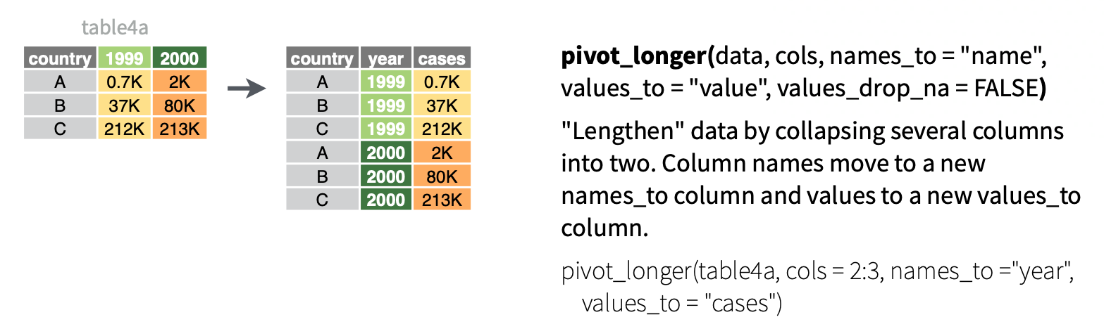
1. Make the data *longer*, i.e. combine values from multiple variables into 1 variable. EXAMPLE: `1999` and `2000` represent two years. We want to *combine* their results into 1 variable without losing any information.
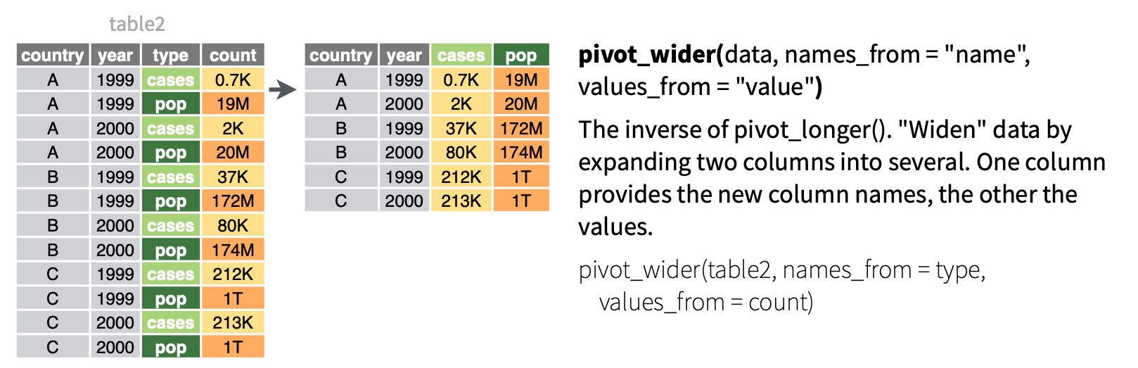
2. Make the data *wider*, i.e. spread out the values across new variables. EXAMPLE: `cases` and `pop` represent two categories within `type`. To compare or combine their `count` outcomes side-by-side, we can *separate* them into their own variables.
\
\
\
\
**EXAMPLE 5: pivot wider**
Because it's a small enough dataset to examine all at once, let's start with our `penguin_avg` data:
```{r}
penguin_avg
```
With the goal of being able to calculate the *difference* in average body mass, male vs female, for each species, let's make the dataset *wider*. That is, let's get one row per `species` with separate columns for the average body mass by `sex`. Put this code into a chunk and run it:
penguin_avg %>% pivot_wider(names_from = sex, values_from = avg_body_mass)
```{r}
```
NOTE:
- `names_from` = the variable whose values we want to separate into their own columns, i.e. where we want to get the new column *names from*
- `values_from` = which variable to take the new column *values from*
FOLLOW-UP:
- What are the units of observation?
- Did we lose any information when we widened the data?
- Use the wide data to calculate the difference in average body mass, male vs female, for each species.
\
\
\
\
**EXAMPLE 6: Pivot longer**
Let's store our wide data:
```{r}
penguin_avg_wide <- penguin_avg %>%
pivot_wider(names_from = sex, values_from = avg_body_mass)
penguin_avg_wide
```
Suppose we wanted to change this data back to a *longer* format. In general, this happens when some variables (here `female` and `male`) represent two categories or values of some *broader* variable (here `sex`), and we want to combine them into that 1 variable without losing any information. Let's `pivot_longer()`:
```{r}
# We can either communicate which variables we WANT to collect into a single column (female, male)
penguin_avg_wide %>%
pivot_longer(cols = c(female, male), names_to = "sex", values_to = "avg_body_mass")
# Or which variable(s) we do NOT want to collect into a single column (sex)
penguin_avg_wide %>%
pivot_longer(cols = -species, names_to = "sex", values_to = "avg_body_mass")
```
NOTE:
- `cols` = the columns (variables) to collect into a single, new variable. we can also specify what variables we *don't* want to collect
- `names_to` = the name of the new variable which will include the *names* or labels of the collected variables
- `values_to` = the name of the new variable which will include the *values* of the collected variables
FOLLOW-UP:
- What are the units of observation?
- Did we lose any information when we lengthened the data?
- Why do we have some variables in quotes "" here (`names_to` and `values_to`) but not when we used `pivot_wider()`?
\
\
\
\
**EXAMPLE 7: Practice**
Let's make up some data on the orders of 2 different customers at 3 different restaurants:
```{r}
food <- data.frame(
customer = rep(c("A", "B"), each = 3),
restaurant = rep(c("Shish", "FrenchMeadow", "DunnBros"), 2),
order = c("falafel", "salad", "coffee", "baklava", "pastry", "tea")
)
food
```
The units of observation in `food` are customer / restaurant combinations. Wrangle this data so that the units of observation are customers, spreading the restaurants into separate columns.
```{r}
```
Consider 2 more customers:
```{r}
more_food <- data.frame(
customer = c("C", "D"),
Shish = c("coffee", "maza"),
FrenchMeadow = c("soup", "sandwich"),
DunnBros = c("cookie", "coffee")
)
more_food
```
Wrangle this data so that the 3 restaurant columns are combined into 1, hence the units of observation are customer / restaurant combinations.
```{r}
```
\
\
\
\
## Exercises
### Exercise 1: What's the problem? {.unnumbered}
Consider data on a sleep study in which subjects received only 3 hours of sleep per night.
Each day, their reaction time to a stimulus (in ms) was recorded.[^10-reshaping-data-1]
NOTE: Important ethical considerations around such studies are discussed [here](https://onlinelibrary.wiley.com/doi/10.1002/smi.2745)!
[^10-reshaping-data-notes-1]: Gregory Belenky, Nancy J. Wesensten, David R. Thorne, Maria L. Thomas, Helen C. Sing, Daniel P. Redmond, Michael B. Russo and Thomas J. Balkin (2003) Patterns of performance degradation and restoration during sleep restriction and subsequent recovery: a sleep dose-response study. Journal of Sleep Research 12, 1–12.
```{r}
sleep_wide <- read.csv("https://mac-stat.github.io/data/sleep_wide.csv")
head(sleep_wide)
```
#### Part a {.unnumbered}
What are the units of observation in `sleep_wide`?
#### Part b {.unnumbered}
Suppose I ask you to plot each subject's reaction time (y-axis) vs the number of days of sleep restriction (x-axis). "Sketch" out in words what the first few rows of the data need to look like in order to do this. It might help to think about what you'd need to complete the plotting frame:
`ggplot(___, aes(y = ___, x = ___, color = ___))`
#### Part c {.unnumbered}
How can you obtain the dataset you sketched in part b?
- just using `sleep_wide`
- `pivot_longer()`
- `pivot_wider()`
\
\
\
\
### Exercise 2: Pivot longer {.unnumbered}
To plot reaction time by day for each subject, we need to reshape the data into a **long** format where each row represents a subject/day combination. Specifically, we want a dataset with 3 columns and a first few rows that look something like this:
| Subject | day | reaction_time |
|--------:|----:|--------------:|
| 308 | 0 | 249.56 |
| 308 | 1 | 258.70 |
| 308 | 2 | 250.80 |
#### Part a {.unnumbered}
Use `pivot_longer()` to create the long-format dataset above. Show the first 3 lines (`head(3)`), which should be *similar* to those above. Follow-up: Thinking forward to plotting reaction time vs day for each subject, what would you like to fix / change about this dataset?
```{r}
# For cols, try 2 appproaches: using - and starts_with
# ___ %>%
# pivot_longer(cols = ___, names_to = "___", values_to = "___")
```
#### Part b {.unnumbered}
Run this chunk:
```{r}
sleep_long <- sleep_wide %>%
pivot_longer(cols = -Subject,
names_to = "day",
names_prefix = "day_",
values_to = "reaction_time")
head(sleep_long)
```
Follow-up:
- Besides putting each argument on a different line for readability and storing the results, what changed in the code?
- How did this impact how the values are recorded in the `day` column?
#### Part c {.unnumbered}
Using `sleep_long`, construct a line plot of reaction time vs day for each subject. This will look goofy no matter what you do. Why? HINT: look back at `head(sleep_long)`. What class or type of variables are `Subject` and `day`? What do we *want* them to be?
```{r}
```
\
\
\
\
### Exercise 3: Changing variable classes & plotting {.unnumbered}
Let's finalize `sleep_long` by *mutating* the `Subject` variable to be a `factor` (categorical) and the `day` variable to be `numeric` (quantitative). Take note of the `mutate()` code! You'll use this type of code a lot.
```{r}
sleep_long <- sleep_wide %>%
pivot_longer(cols = -Subject,
names_to = "day",
names_prefix = "day_",
values_to = "reaction_time") %>%
mutate(Subject = as.factor(Subject), day = as.numeric(day))
# Check it out
# Same data, different class
head(sleep_long)
```
#### Part a {.unnumbered}
*Now* make some plots.
```{r}
# Make a line plot of reaction time by day for each subject
# Put these all on the same frame
```
```{r}
# Make a line plot of reaction time by day for each subject
# Put these all on separate frames (one per subject)
```
#### Part b {.unnumbered}
Summarize what you learned from the plots. For example:
- What's the general relationship between reaction time and sleep?
- Is this the same for everybody? What differs?
\
\
\
\
### Exercise 4: Pivot wider {.unnumbered}
Make the data *wide* again, with each day becoming its own column.
#### Part a {.unnumbered}
Adjust the code below. What don't you like about the column labels?
```{r}
# sleep_long %>%
# pivot_wider(names_from = ___, values_from = ___) %>%
# head()
```
#### Part b {.unnumbered}
Using your intuition, adjust your code from part a to name the reaction time columns "day_0", "day_1", etc.
```{r}
# sleep_long %>%
# pivot_wider(names_from = ___, values_from = ___, names_prefix = "___") %>%
# head()
```
\
\
\
\
### Exercise 5: Practice with Billboard charts {.unnumbered}
Load data on songs that hit the `billboard` charts around the year 2000. Included for each song is the `artist` name, `track` name, the date it hit the charts (`date.enter`), and `wk`-related variables that indicate rankings in each subsequent week on the charts. IMPORTANT: The lower the ranking, the more popular a song!
```{r}
# Load data
library(tidyr)
data("billboard")
# Check it out
head(billboard)
```
In using this data, you'll need to determine if and when the data needs to be reshaped for the task at hand.
#### Part a {.unnumbered}
Construct and summarize a plot of how a song's Billboard ranking its 2nd week on the chart (y-axis) is related to its ranking the 1st week on the charts (x-axis). Add a reference line `geom_abline(intercept = 0, slope = 1)`. Songs *above* this line had their ranking go up (hence *worsen*) from the 1st to 2nd week.
```{r}
```
#### Part b {.unnumbered}
Use your wrangling tools to identify *which* songs are those above the line in Part a, i.e. with rankings that worsened from week 1 to week 2.
```{r}
```
#### Part c {.unnumbered}
Define a new dataset, `nov_1999`, which:
- only includes data on songs that entered the Billboard charts on November 6, 1999
- keeps all variables *except* `track` and `date.entered`. HINT: How can you avoid writing out all the variable names you want to keep?
```{r}
# Define nov_1999
# Confirm that nov_1999 has 2 rows (songs) and 77 columns
```
#### Part d {.unnumbered}
Create and discuss a visualization of the rankings (y-axis) over time (x-axis) for the 2 songs in `nov_1999`. There are hints below (if you scroll), but you're encouraged to play around and use as few hints as possible.
```{r}
```
Hints:
- Should you first pivot wider or longer?
- Once you pivot, the week number is turned into a character variable. How can you change it to a number?
\
\
\
\
### Exercise 6: Practice with the Daily Show {.unnumbered}
The data associated with [this article](https://fivethirtyeight.com/datalab/every-guest-jon-stewart-ever-had-on-the-daily-show/) is available in the `fivethirtyeight` package, and is loaded into `daily` below. It includes a list of every guest to ever appear on Jon Stewart's The Daily Show, a "late-night talk and satirical news" program (per Wikipedia). Check out the dataset and note that when multiple people appeared together, each person receives their own line:
```{r}
library(fivethirtyeight)
data("daily_show_guests")
daily <- daily_show_guests
```
In analyzing this data, you'll need to determine if and when the data needs to be reshaped.
#### Part a {.unnumbered}
Identify the 16 guests that appeared the most. (This isn't a very diverse guest list!)
```{r}
```
#### Part b {.unnumbered}
CHALLENGE: Create the following data set containing 19 columns:
- The first column should have the 16 guests with the highest number of total appearances on the show, listed in descending order of number of appearances.
- 17 columns should show the number of appearances of the corresponding guest in each year from 1999 to 2015 (one per column).
- Another column should show the total number of appearances for the corresponding guest over the entire duration of the show.
There are hints below (if you scroll), but you're encouraged to play around and use as few hints as possible.
```{r}
```
HINTS: There are lots of ways to do this. You don't necessarily need all of these hints.
- First obtain the number of times a guest appears each year.
- To this, add a new column which includes the total number of times a guest appears across all years.
- Pivot (longer or wider?). When you do, use `values_fill = 0` to replace NA values with 0.
- Arrange, then and keep the top 16.
#### Part c {.unnumbered}
Let's recreate the first figure from [the article](https://fivethirtyeight.com/datalab/every-guest-jon-stewart-ever-had-on-the-daily-show/). This groups all guests into 3 broader occupational categories. However, our current data has 18 categories:
```{r}
daily %>%
count(group)
```
Let's define a new dataset that includes a new variable, `broad_group`, that buckets these 18 categories into the 3 bigger ones used in the article. And get rid of any rows missing information on `broad_group`. You'll learn the code soon! For now, just run this chunk:
```{r}
plot_data <- daily %>%
mutate(broad_group = case_when(
group %in% c("Acting", "Athletics", "Comedy", "Musician") ~ "Acting, Comedy & Music",
group %in% c("Media", "media", "Science", "Academic", "Consultant", "Clergy") ~ "Media",
group %in% c("Politician", "Political Aide", "Government", "Military", "Business", "Advocacy") ~ "Government and Politics",
.default = NA
)) %>%
filter(!is.na(broad_group))
```
Now, using the `broad_group` variable in `plot_data`, recreate the graphic from the article, with three different lines showing the fraction of guests in each group over time. Note: You'll have to wrangle the data first.
```{r}
```
\
\
\
\
\
\
\
\
### What's next?! {.unnumbered}
If you finish early, use the time to work on Homework 4.
\
\
\
\