The peaks data includes information on hiking trails in the 46 “high peaks” in the Adirondack mountains of northern New York state:
# Load useful packages and datalibrary(readr)library(ggplot2)library(dplyr)peaks <-read_csv("https://mac-stat.github.io/data/high_peaks.csv") %>%mutate(ascent = ascent /1000)# Check it out head(peaks)
Below is a model of the time (in hours) that it takes to complete a hike by the hike’s length (in miles), vertical ascent(in 1000s of feet), and rating (easy, moderate, or difficult):
Interpret the length and ratingeasy coefficients in the model formula below by using our strategy:
Strategy: When interpreting a coefficient for a variable x, compare two units whose values of x differ by 1 but who are identical for all other variables.
Interpreting the coefficient \(\beta_Q\) for a quantitative variable Q:
Holding all other variables constant, each unit increase in Q is associated with \(\beta_Q\) change (note if it’s an increase or decrease) in Y on average.
Interpreting the coefficient \(\beta_C\) for an indicator variable:
Holding all other variables constant, the average outcome for the group referenced by this indicator (group for whom indicator = 1), is \(\beta_C\) higher/lower than that of the reference group.
Exercise 2: Confounders
Research question: Is there a wage gap, hence possibly discrimination, by marital status among 18-34 year olds?
To explore, we can revisit the cps data with employment information collected by the U.S. Current Population Survey (CPS) in 2018. View the codebook here.
# Import datacps <-read_csv("https://mac-stat.github.io/data/cps_2018.csv") %>%filter(age >=18, age <=34) %>%filter(wage <250000)
Rows: 10000 Columns: 8
── Column specification ────────────────────────────────────────────────────────
Delimiter: ","
chr (4): marital, industry, health, education_level
dbl (4): wage, age, education, hours

ℹ Use `spec()` to retrieve the full column specification for this data.
ℹ Specify the column types or set `show_col_types = FALSE` to quiet this message.
# Check it outhead(cps)
# A tibble: 6 × 8
   wage   age education marital industry   health    hours education_level
  <dbl> <dbl>     <dbl> <chr>   <chr>      <chr>     <dbl> <chr>
1 75000    33        16 single  management fair         40 bachelors
2 33000    19        16 single  management very_good    40 bachelors
3 43000    33        16 married management good         40 bachelors
4 50000    32        12 single  management excellent    40 HS
5 14400    28        12 single  service    excellent    40 HS
6 33000    31        16 married management very_good    45 bachelors
Recall that a simple linear regression model of wage by marital suggests that single workers make $17,052 less than married workers:
wage_model_1 <-lm(wage ~ marital, data = cps)coef(summary(wage_model_1))
That’s a big gap!!
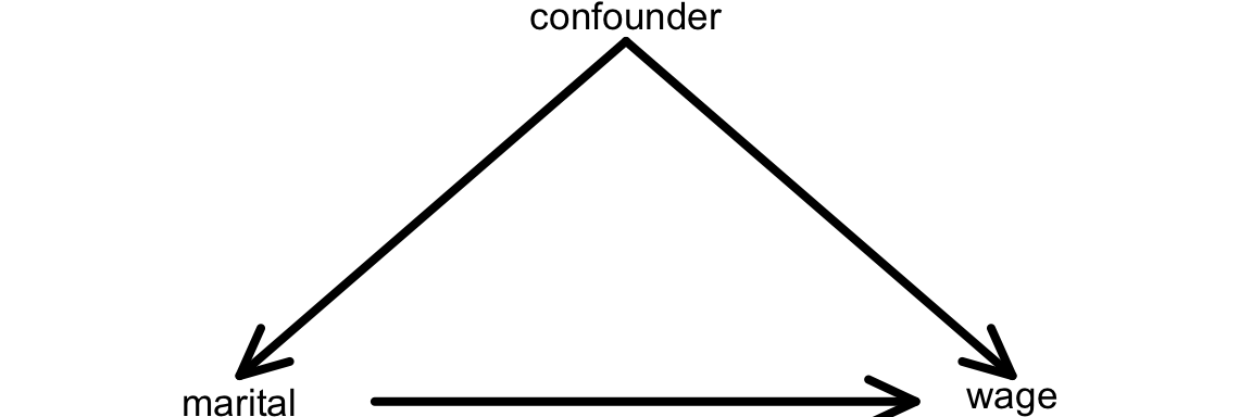
BUT this model ignores important confounding variables that might help explain this gap.
A confounding variable is a cause of both the predictor of interest (marital) and of the response variable (wage).
We can represent this idea with a causal diagram:
Another definition of a confounding variable is one that
is a cause of the outcome (wage)
is associated with the main variable of interest (marital status)
NOT caused by the variable of interest
We can represent this on the causal diagram with a line from the confounder to the variable of interest (instead of an arrow):
Name at least 2 potential confounders.
Exercise 3: Controlling for confounders
When exploring the relationship between response a response variable y (wage) and some predictor x (marital), there are often confounding variables for which we want to control or adjust.
Sometimes, we can control (adjust) for confounding variables through a carefully designed experiment. For example, in comparing the effectiveness (y) of 2 different cold remedies (x), we might want to control for the age, general health, and severity of symptoms among the participants. How might we do that?
BUT we’re often working with observational, not experimental, data. Why? Well, explain what an experiment might look like if we wanted to explore the relationship between wage (y) and marital status (x) while controlling for age.
Exercise 4: Age
We’re in luck.
We can control (adjust) for confounding variables by including them in our model!
That’s one of the superpowers of multiple linear regression.
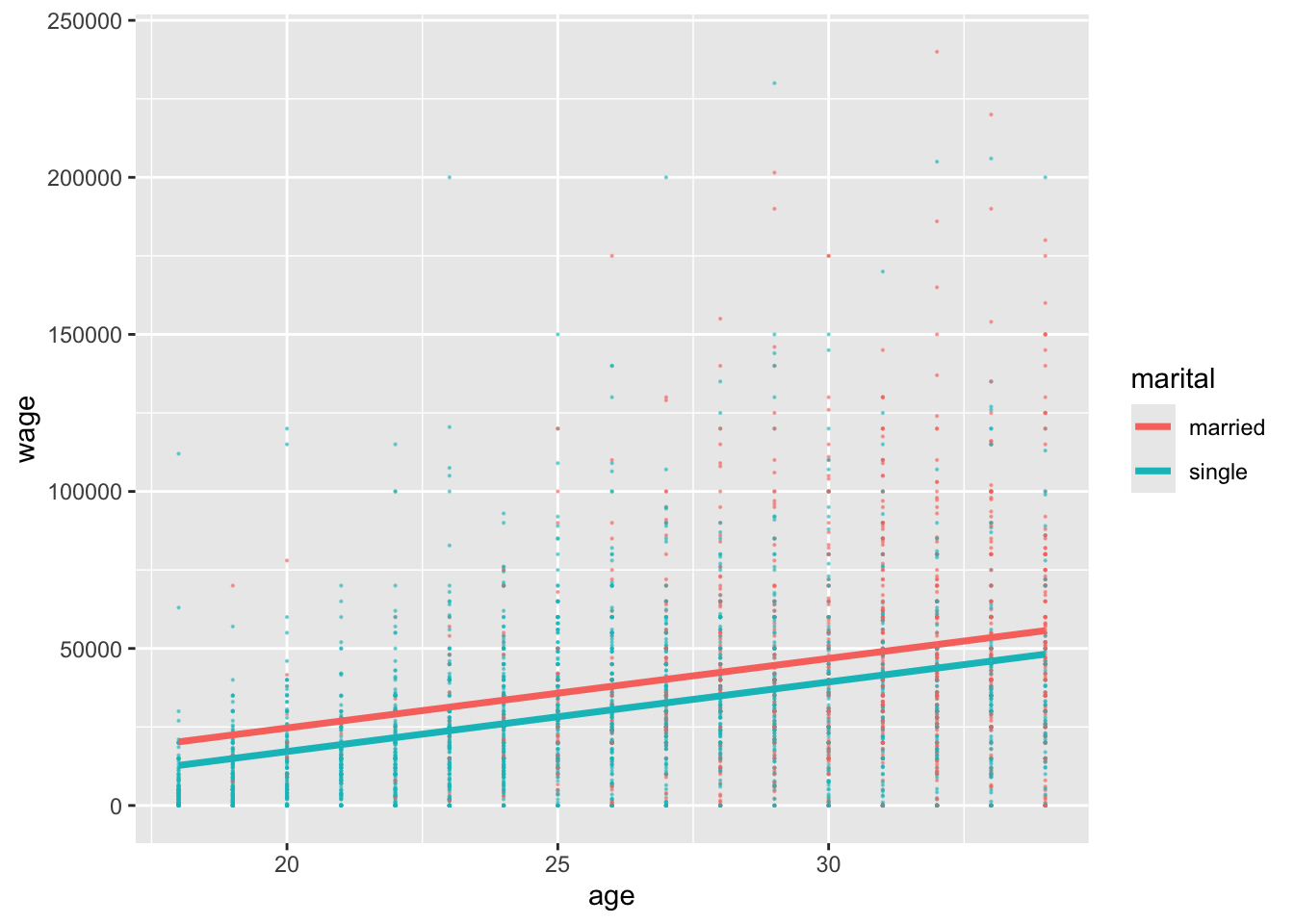
Let’s start simple, by controlling for age in our model of wages by marital status:
# Construct the modelwage_model_2 <-lm(wage ~ marital + age, cps)coef(summary(wage_model_2))
Visualize this model by modifying the code below. Note: The last line makes sure that the geom_smooth matches our model assumptions.
ggplot(cps, aes(y = ___, x = ___, color = ___)) +geom____(size =0.1, alpha =0.5) +geom_line(aes(y = wage_model_2$fitted.values), linewidth =1.25)
Suppose 2 workers are the same age, but one is married and one is single. By how much do we expect the single worker’s wage to differ from the married worker’s wage? (How does this compare to the $17,052 marital gap among all workers?)
How can we interpret the maritalsingle coefficient?
Exercise 5: More confounders
Let’s control for even more potential confounders!
Model wages by marital status while controlling for ageand years of education:
wage_model_3 <-lm(wage ~ marital + age + education, cps)coef(summary(wage_model_3))
With so many variables, this is a tough model to visualize. If you had to draw it, how would the model trend appear: 1 point, 2 points, 2 lines, 1 plane, or 2 planes? Explain your rationale. Hint: pay attention to whether your predictors are quantitative or categorical.
Given our research question, which coefficient is of primary interest? Interpret this coefficient.
Interpret the two other coefficients in this model.
Exercise 6: Even more
Let’s control for another potential confounder, the job industry in which one works (categorical):
If we had to draw it, this model would appear as 12 planes.
The original plane explains the relationship between wage and the 2 quantitative predictors, age and education.
Then this plane is split into 12 (2*6) individual planes, 1 for each possible combination of marital status (2 possibilities) and industry (6 possibilities).
Interpret the main coefficient of interest for our research question.
When controlling for a worker’s age, marital status, and education level, which industry tends to have the highest wages? The lowest? Note: the following table shows the 6 industries:
cps %>%count(industry)
Exercise 7: Biggest model yet
Build a model that helps us explore wage by marital status while controlling for: age, education, job industry, typical number of work hours, and health status.
Store this model as wage_model_5.
Exercise 8: Reflection
Take two workers – one is married and the other is single.
The models above provided the following insights into the typical difference in wages for these two groups:
Model
Assume the two people have the same…
Wage difference
wage_model_1
NA
-$17,052
wage_model_2
age
-$7,500
wage_model_3
age, education
-$6,478
wage_model_4
age, education, industry
-$5,893
wage_model_5
age, education, industry, hours, health
-$4,993
Though not the case in every analysis, the marital coefficient got closer and closer to 0 as we controlled for more confounders. Explain the significance of this phenomenon, in context - what does it mean?
Do you still find the wage gap for single vs married people to be meaningfully “large”? Can you think of any remaining factors that might explain part of this remaining gap? Or do you think we’ve found evidence of inequitable wage practices for single vs married workers?
Exercise 9: A new (extreme) example
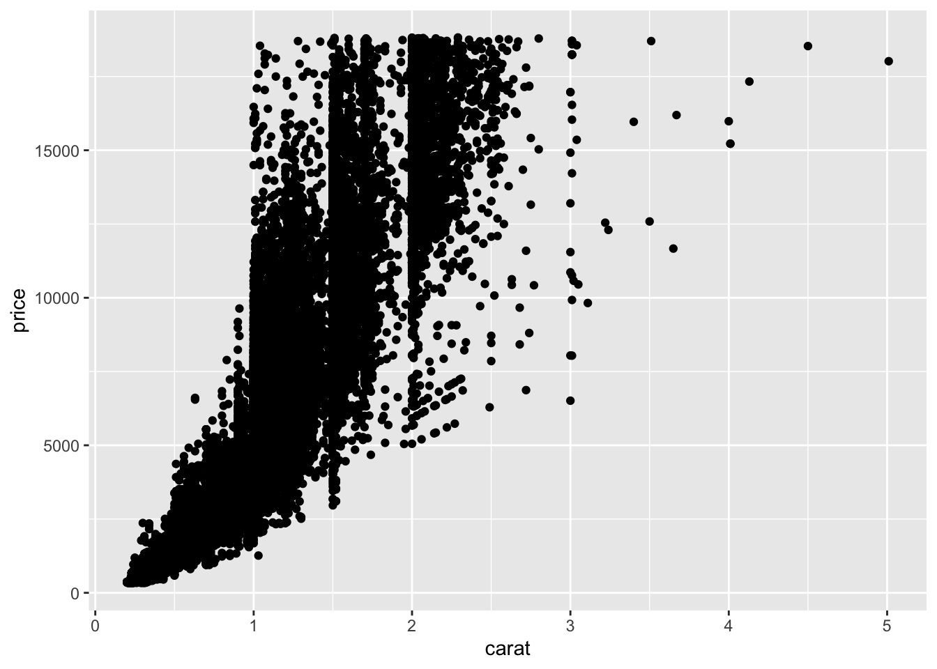
For a more extreme example of why it’s important to control for confounding variables, let’s return to the diamonds data:
Our goal is to explore how the price of a diamond depends upon its clarity (a measure of quality).
Clarity is classified as follows, in order from best to worst:
clarity
description
IF
flawless (no internal imperfections)
VVS1
very very slightly imperfect
VVS2
” ”
VS1
very slightly imperfect
VS2
” ”
SI1
slightly imperfect
SI2
” ”
I1
imperfect
Check out a model of price by clarity. What clarity has the highest average price? The lowest? (This is surprising!)
diamond_model_1 <-lm(price ~ clarity, data = diamonds)# Get a model summarycoef(summary(diamond_model_1))
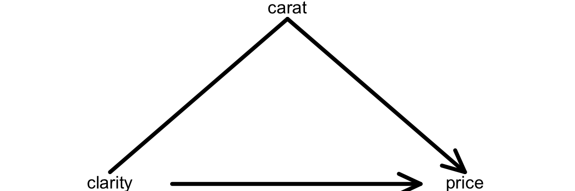
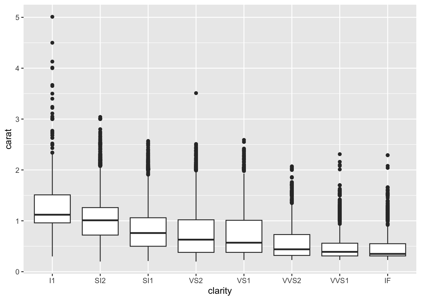
What confounding variable might explain these results? What’s your rationale?
Exercise 10: Size
It turns out that carat, the size of a diamond, is an important confounding variable.
Let’s explore what happens when we control for this in our model:
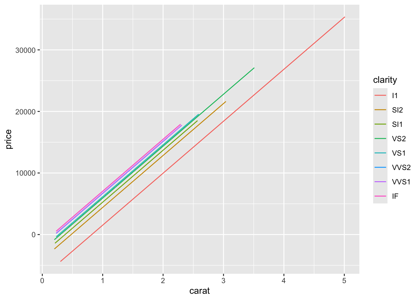
diamond_model_2 <-lm(price ~ clarity + carat, data = diamonds)# Get a model summarycoef(summary(diamond_model_2))# Plot the modeldiamonds %>%ggplot(aes(y = price, x = carat, color = clarity)) +geom_line(aes(y = diamond_model_2$fitted.values))
What do you think now?
Which clarity has the highest expected price?
The lowest?
Provide numerical evidence from the model.
Exercise 11: Simpson’s Paradox
Controlling for carat didn’t just change the clarity coefficients, hence our understanding of the relationship between price and clarity… It flipped the signs of many of these coefficients.
This extreme scenario has a name: Simpson’s paradox.
CHALLENGE: Explain why this happened and support your argument with graphical evidence.
HINTS: Think about the causal diagram below. How do you think carat influences clarity? How do you think carat influences price? Make 2 ggplot() that support your answers.
Exercise 12: Final conclusion
What’s your final conclusion about diamond prices?
Which diamonds are more expensive: flawed ones or flawless ones?
Reflection
Write a one-sentence warning label for what might happen if we do not control for confounding variables in our model.
Among hikes with the same vertical ascent and challenge rating, each additional mile of the hike is associated with a 0.46 hour increase in completion time on average.
Holding vertical ascent and challenge rating constant (fixed), each additional mile of the hike is associated with a 0.46 hour increase in completion time on average.
ratingeasy coefficient:
Among hikes with the same length and vertical ascent, the average completion time of easy hikes is 3.2 hours less than that of difficult hikes (reference category).
Holding constant hike length and vertical ascent, the average completion time of easy hikes is 3.2 hours less than that of difficult hikes.
Exercise 2: Confounders
age, education, job industry, …
Exercise 3: Controlling for confounders
create 2 separate groups that are as similar as possible with respect to these variables. give the groups different remedies.
we’d have to get 2 groups that are similar with respect to age, and assign 1 group to get married and 1 group to be single. that would be weird (and unethical).
Exercise 4: Age
# Construct the modelwage_model_2 <-lm(wage ~ marital + age, cps)coef(summary(wage_model_2))
                Estimate Std. Error   t value     Pr(>|t|)
(Intercept)   -19595.948  3691.6998 -5.308110 1.184066e-07
maritalsingle  -7500.146  1191.8526 -6.292847 3.545964e-10
age             2213.869   120.7701 18.331265 2.035782e-71
.
cps %>%ggplot(aes(y = wage, x = age, color = marital)) +geom_point(size =0.1, alpha =0.5) +geom_line(aes(y = wage_model_2$fitted.values), size =1.25)
Warning: Using `size` aesthetic for lines was deprecated in ggplot2 3.4.0.
ℹ Please use `linewidth` instead.
-$7500
When controlling for (“holding constant”) age, single workers make $7500 less than married workers on average.
Among workers of the same age, single workers make $7500 less than married workers on average.
Exercise 5: More confounders
wage_model_3 <-lm(wage ~ marital + age + education, cps)coef(summary(wage_model_3))
                Estimate Std. Error    t value     Pr(>|t|)
(Intercept)   -64898.607  4099.8737 -15.829416 2.254709e-54
maritalsingle  -6478.094  1119.9345  -5.784351 7.988760e-09
age             1676.796   116.3086  14.416777 1.102113e-45
education       4285.259   207.2158  20.680173 3.209448e-89
2 planes: There are 2 quantitative predictors which form the dimensions of the plane. The marital status categorical predictor creates 2 planes.
The maritalsingle coefficient is of main interest:
Among workers of the same age and years of education, single workers earn $6478 less than married workers.
age coefficient: Among workers of the same marital status and years of education, each additional year of age is associated with a $1677 increase in salary on average.
education coefficient: Among workers of the same marital status and age, each additional year of education is associated with a $4285 increase in salary on average.