library(ggplot2)

shaded_normal <- function(mean, sd, a = NULL, b = NULL){
  min_x <- mean - 4*sd
  max_x <- mean + 4*sd
  a <- max(a, min_x)
  b <- min(b, max_x)
  ggplot() +
    scale_x_continuous(limits = c(min_x, max_x), breaks = c(mean - sd*(0:3), mean + sd*(1:3))) +
    stat_function(fun = dnorm, args = list(mean = mean, sd = sd)) +
    stat_function(geom = "area", fun = dnorm, args = list(mean = mean, sd = sd), xlim = c(a, b), fill = "blue") +
    labs(y = "density") +
    theme_minimal()
}The Normal model & sampling variation
Notes and in-class exercises
Notes
- You can download a template file to work with here.
- File organization: Save this file in the “Activities” subfolder of your “STAT155” folder.
Learning goals
- Recognize the difference between a population parameter and a sample estimate.
- Review the Normal probability model, a tool we’ll need to turn information in our sample data into inferences about the broader population.
- Explore the ideas of randomness, sampling distributions, and standard error through a class experiment. (We’ll define these more formally in the next class.)
Readings and videos
Before class you should have read and watched:
- Reading: Section 6 Introduction, and Section 6.6 in the STAT 155 Notes
- Video 1: exploration vs inference
- Video 2: Normal probability model
Exercises: Normal distribution
Let’s practice some Normal model concepts.
First, run the following chunk which defines a shaded_normal() function which is specialized to this activity alone:
Exercise 1: Using the Normal model
Suppose that the speeds of cars on a highway, in miles per hour, can be reasonably represented by the Normal model with a mean of 55mph and a standard deviation of 5mph from car to car:
\[ X \sim N(55, 5^2) \]
shaded_normal(mean = 55, sd = 5)- Provide the (approximate) range of the middle 68% of speeds, and shade in the corresponding region on your Normal curve. NOTE:
ais the lower end of the range andbis the upper end.
shaded_normal(mean = 55, sd = 5, a = ___, b = ___)- Use the 68-95-99.7 rule to estimate the probability that a car’s speed exceeds 60mph.
Your response here
# Visualize
shaded_normal(mean = 55, sd = 5, a = 60)- Which of the following is the correct range for the probability that a car’s speed exceeds 67mph? Explain your reasoning.
- less than 0.0015
- between 0.0015 and 0.025
- between 0.025 and 0.16
- greater than 0.16
Explain your reasoning here
# Visualize
shaded_normal(mean = 55, sd = 5, a = 67)
Exercise 2: Z-scores
Inherently important to all of our calculations above is how many standard deviations a value “X” is from the mean.
This distance is called a Z-score and can be calculated as follows:
\[ \text{Z-score} = \frac{X - \text{mean}}{\text{sd}} \]
For example (from Exercise 1), if I’m traveling 40 miles an hour, my Z-score is -3. That is, my speed is 3 standard deviations below the average speed:
(40 - 55) / 5Consider 2 other drivers. Both drivers are speeding. Who do you think is speeding more, relative to the distributions of speed in their area?
- Driver A is traveling at 60mph on the highway where speeds are N(55, 5^2) and the speed limit is 55mph.
- Driver B is traveling at 36mph on a residential road where speeds are N(30, 3^2) and the speed limit is 30mph.
Put your best guess (hypothesis) here
- Calculate the Z-scores for Drivers A and B.
# Driver A


# Driver B- Now, based on the Z-scores, who is speeding more? NOTE: The below plots might provide some insights.
# Driver A
shaded_normal(mean = 55, sd = 5) +
  geom_vline(xintercept = 60)

# Driver B
shaded_normal(mean = 30, sd = 3) +
  geom_vline(xintercept = 36)
Your response here
Exercises: Sampling variation
The below exercises require 2 new packages. Type the following into your console to install them:
- install.packages(“gsheet”)
- install.packages(“usdata”)
The county_complete data in the usdata package includes demographic data on 3142 U.S. counties. (Image: Wikimedia Commons)
.png)

Our goal will be to model the relationship between the per capita income in 2019 and 2017 (in $1000s) among U.S. counties:
# Load the data & handy packages
library(dplyr)
Attaching package: 'dplyr'The following objects are masked from 'package:stats':
filter, lagThe following objects are masked from 'package:base':
intersect, setdiff, setequal, unionlibrary(usdata)
data(county_complete)
# Wrangle the data
county_clean <- county_complete %>%
mutate(pci_2019 = per_capita_income_2019 / 1000,
pci_2017 = per_capita_income_2017 / 1000) %>%
select(state, name, fips, pci_2019, pci_2017)# Plot the relationship
county_clean %>%
ggplot(aes(y = pci_2019, x = pci_2017)) +
geom_point() +
geom_smooth(method = "lm", se = FALSE)
# Model the relationship
pop_model <- lm(pci_2019 ~ pci_2017, data = county_clean)
coef(summary(pop_model))Exercise 3: Parameter vs estimate
The Intercept and pci_2017 coefficients are population parameters.
In order to conduct statistical inference, we typically assume that there is some true, underlying, fixed intercept and slope \(\beta_0\) and \(\beta_1\), that describe the true linear relationship in the overall population that we’re interested in. In this case, the population some process underlying per capita income is U.S. counties.
The true underlying model we assume is thus:
\[ E[pci\_2019 \mid pci\_2017] = \beta_0 + \beta_1 pci\_2017 \]
We typically don’t have access to our entire population of interest, even at a fixed time point. In this scenario, however, we do have access to our finite population parameters at this time, since we have data from every county! These are estimates of the true, population parameters from our underlying, generative process. Our statistical model provides us with estimates of these parameters:
\[ E[pci\_2019 \mid pci\_2017] = \hat{\beta}_0 + \hat{\beta}_1 pci\_2017 \] where our estimates are given by our model as \(\hat{\beta}_0 = 1.294\), \(\hat{\beta}_1 = 1.027\)
Below, we’ll simulate the concept of random sampling, from the data that we have. You’ll each take a random sample of 10 U.S. counties, and we’ll see if we can recover the observed, finite population parameters from the whole dataset containing information from every county.
First, fill in your intuition below:
- Do you think every student will get the same set of 10 counties?
Your response here
- Do you think that your coefficient estimates will be the same as your neighbors’?
Your responses here
Exercise 4: Random sampling
- Use the
sample_n()function to take a random sample of 2 counties.
# Try running the following chunk A FEW TIMES
sample_n(county_clean, size = 2, replace = FALSE)
Reflect:
- How do your results compare to your neighbors’?
Your response here
- What is the role of
size = 2? HINT: Remember you can look at function documentation by running?sample_nin the console!
Your response here
- What is the role of
replace = FALSE? HINT: Remember you can look at function documentation by running?sample_nin the console!
Your response here
- Now, “set the seed” to 155 and re-try your sampling.
# Try running the following FULL chunk A FEW TIMES
set.seed(155)
sample_n(county_clean, size = 2, replace = FALSE)
What changed?
Your response here
Exercise 5: Take your own sample
The underlying random number generator plays a role in the random sample we happen to get. If we set.seed(some positive integer) before taking a random sample, we’ll get the same results.
This reproducibility is important:
we get the same results every time we render our qmd
we can share our work with others & ensure they get our same answers
it wouldn’t be great if you submitted your work to, say, a journal and weren’t able to back up / confirm / reproduce your results!
Follow the chunks below to obtain and use your own unique sample.
# DON'T SKIP THIS STEP!
# Set the random number seed to your own phone number (just the numbers)
set.seed(___)

# Take a sample of 10 counties
my_sample <- sample_n(county_clean, size = 10, replace = FALSE)
my_sample
# Plot the relationship of pci_2019 with pci_2017 among your sample
my_sample %>%
ggplot(aes(y = pci_2019, x = pci_2017)) +
geom_point() +
geom_smooth(method = "lm", se = FALSE)# Model the relationship among your sample
my_model <- lm(pci_2019 ~ pci_2017, data = my_sample)
coef(summary(my_model))REPORT YOUR WORK
Indicate your intercept and slope sample estimates in this survey.
Exercise 6: Sampling variation
Recall the estimates of the population parameters, at this fixed point in time, describing the relationship between pci_2019 and pci_2017:
\[ E[pci\_2019 \mid pic\_2017] = 1.294 + 1.027 pci\_2017 \]
Let’s explore how our sample estimates of these parameters varied from student to student:
# Import the experiment results
library(gsheet)
results <- gsheet2tbl('https://docs.google.com/spreadsheets/d/11OT1VnLTTJasp5BHSKulgJiCbSLiutv8mKDOfvvXZSo/edit?usp=sharing')
Plot each student’s sample estimate of the model line (gray). How do these compare to the population model (red)?
county_clean %>%
  ggplot(aes(y = pci_2019, x = pci_2017)) +
  geom_abline(data = results, aes(intercept = sample_intercept, slope = sample_slope), color = "gray") +
  geom_smooth(method = "lm", color = "red", se = FALSE)
Exercise 7: Sample intercepts
Let’s focus on just the sample estimates of the intercept parameter:
results %>%
  ggplot(aes(x = sample_intercept)) +
  geom_density() +
  geom_vline(xintercept = 1.294, color = "red")
Comment on the shape, center, and spread of these sample estimates and how they relate to the actual population intercept (red).
Your response here
Exercise 8: Slopes
Suppose we were to construct a density plot of the sample estimates of the pci_2017 coefficient (slope) .
- Intuitively, what shape do you think this plot will have?
Your response here
- Intuitively, around what value do you think this plot will be centered?
Your response here
- Check your intuition:
results %>%
  ggplot(aes(x = sample_slope)) +
  geom_density() +
geom_vline(xintercept = 1.027, color = "red")- Thinking back to the 68-95-99.7 rule, visually approximate the standard deviation among the sample slopes.
Your response here
Exercise 9: Standard error
You’ve likely observed that the typical or mean slope estimate is roughly equal to the actual population slope parameter, 1.027:
results %>%
  summarize(mean(sample_slope))
Thus the standard deviation of the slope estimates measures how far we might expect an estimate to fall from the actual population slope.
That is, it measures the typical or standard error in our sample estimates:
results %>%
summarize(sd(sample_slope))- Recall your sample estimate of the slope. How far is it from the population slope, 1.027?
- How many standard errors does your estimate fall from the population slope? That is, what’s your Z-score?
- Reflecting upon your Z-score, do you think your sample estimate was one of the “lucky” ones, or one of the “unlucky” ones?
Your response here
Solutions
Exercise 1: Using the Normal model
- .
shaded_normal(mean = 55, sd = 5, a = 50, b = 60)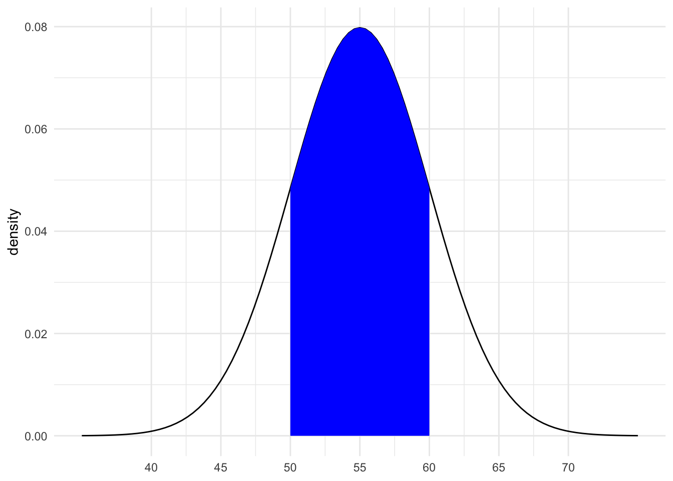
16% (32/2)
between 0.0015 and 0.025
Exercise 2: Z-scores
intuition
.
# Driver A
(60 - 55) / 5
[1] 1# Driver B
(36 - 30) / 3[1] 2- B, they are 2 standard deviations above the mean (the speed limit)
Exercise 3: Parameter vs estimate
intuition
Exercise 4: Random sampling
# Observe that the 2 counties change every time & differ from your neighbors' samples
sample_n(county_clean, size = 2, replace = FALSE)
state name fips pci_2019 pci_2017
1 Kentucky Jefferson County 21111 33.251 30.61777
2 Virginia Galax city 51640 23.025 22.66133# Observe that the 2 counties are the same every time & are the same as your neighbors' samples
set.seed(155)
sample_n(county_clean, size = 2, replace = FALSE) state name fips pci_2019 pci_2017
1 Tennessee Robertson County 47147 29.524 26.29889
2 Illinois Shelby County 17173 27.029 24.84449Exercise 5: Take your own sample
will vary from student to student
Exercise 6: Sampling variation
The sample estimates vary around the population model:
# Import the experiment results
library(gsheet)
results <- gsheet2tbl('https://docs.google.com/spreadsheets/d/11OT1VnLTTJasp5BHSKulgJiCbSLiutv8mKDOfvvXZSo/edit?usp=sharing')

county_clean %>%
  ggplot(aes(y = pci_2019, x = pci_2017)) +
  geom_abline(data = results, aes(intercept = sample_intercept, slope = sample_slope), color = "gray") +
  geom_smooth(method = "lm", color = "red", se = FALSE)
`geom_smooth()` using formula = 'y ~ x'Warning: Removed 2 rows containing non-finite outside the scale range
(`stat_smooth()`).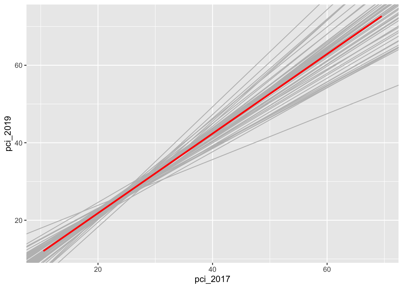
Exercise 7: Sample intercepts
The intercepts are roughly normal, centered around the population intercept (1.294), and range from roughly -7.246 to 7.364:
results %>%
  ggplot(aes(x = sample_intercept)) +
  geom_density() +
  geom_vline(xintercept = 1.294, color = "red")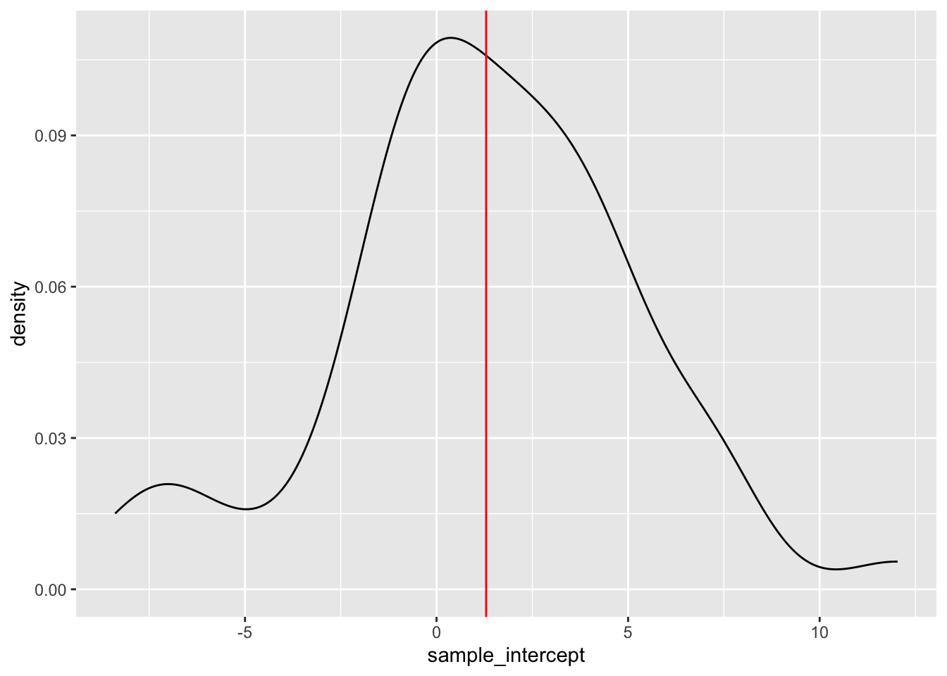
Exercise 8: Slopes
- intuition
- intuition
- Check your intuition:
results %>%
  ggplot(aes(x = sample_slope)) +
  geom_density() +
  geom_vline(xintercept = 1.027, color = "red")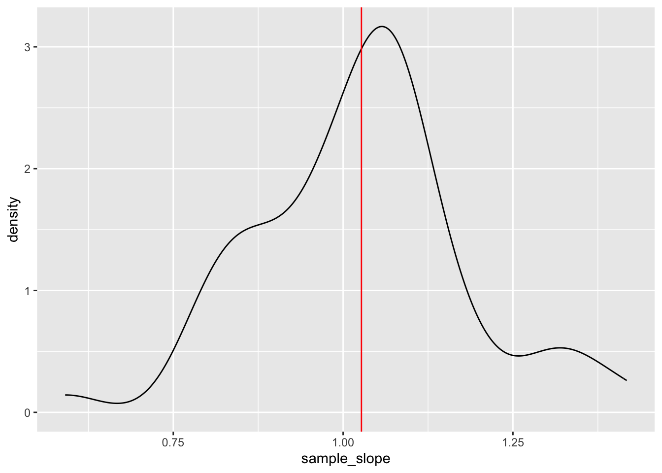
- Will vary, but should roughly be 0.16.
Exercise 9: Standard error
- For example, suppose my estimate were 1.1:
1.1 - 1.027[1] 0.073For example, suppose my estimate were 1.1. Then my Z-score is (1.1 - 1.027) / 0.16 = 0.45625
This is somewhat subjective. But we’ll learn that if your estimate is within 2 sd of the actual slope, i.e. your Z-score is between -2 and 2, you’re pretty “lucky”.