Explain why randomized controlled trials (RCTs) are the gold standard for causal inference
Make connections to the structure of a causal diagram for an RCT
Explain the importance of blinding study subjects and investigators
Evaluate the pros and cons of different randomization strategies
Explain the role of precision variables in the analysis of RCT results
Conduct balance checks to assess the quality of a particular randomization
You can download a template file for this activity here.
library(dagitty)library(tidyverse)
── Attaching core tidyverse packages ──────────────────────── tidyverse 2.0.0 ──
✔ dplyr     1.1.4     ✔ readr     2.1.5
✔ forcats   1.0.0     ✔ stringr   1.5.1
✔ ggplot2   3.5.1     ✔ tibble    3.2.1
✔ lubridate 1.9.3     ✔ tidyr     1.3.1
✔ purrr     1.0.2
── Conflicts ────────────────────────────────────────── tidyverse_conflicts() ──
✖ dplyr::filter() masks stats::filter()
✖ dplyr::lag()    masks stats::lag()
ℹ Use the conflicted package (<http://conflicted.r-lib.org/>) to force all conflicts to become errors
library(broom)library(cobalt)
cobalt (Version 4.5.5, Build Date: 2024-04-02)
Terminology
Also called randomized controlled trials (RCTs)
In industry, called A/B testing
What is a randomized experiment?
A study design in which units are randomly assigned to treatment conditions, which is a form of intervention.
Note: I’m intentionally using the term “treatment condition” rather than “treatment group” here.
Treatment groups are the groups with different values of the treatment variable: 1 = receives treatment, 0 = control group that doesn’t receive treatment.
A treatment condition is a particular treatment group in a particular environment. A hugely important part of the environment ends up being time. We’ll explore this more shortly.
Nonexperimental studies are generally called observational studies because investigators only get to observe the experiences of study units without intervening.
Why are RCTs regarded as the gold standard for causal inference?
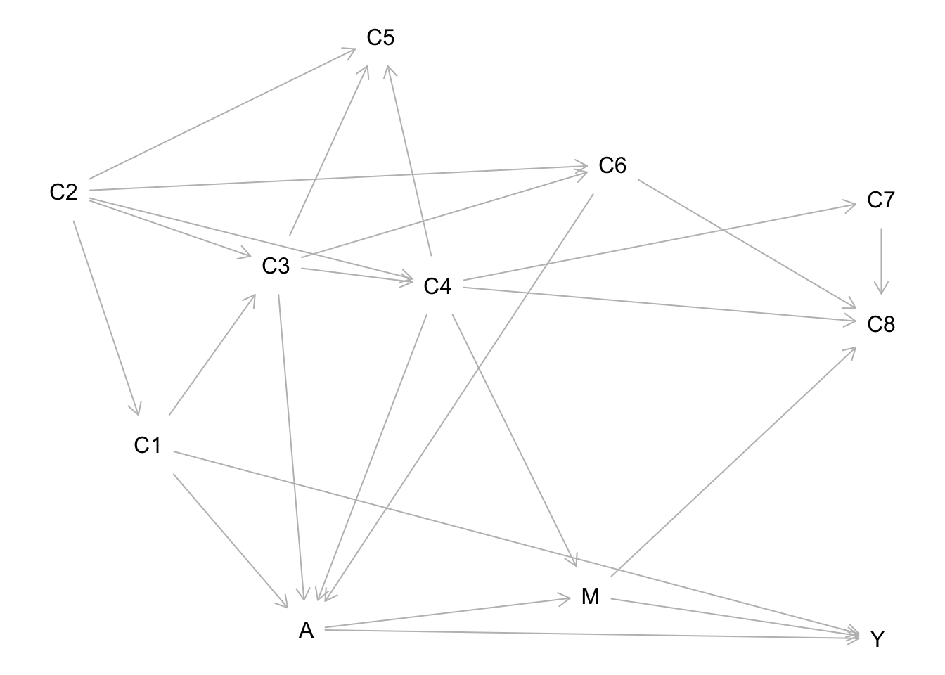
The causal graph below shows a hypothesized data-generating process relevant to a treatment \(A\) and outcome \(Y\). This is what we would have to work with in an observational study.
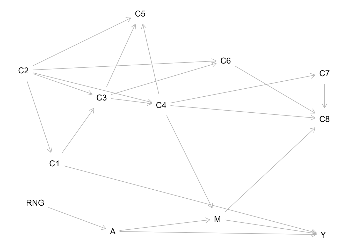
The data-generating process for a randomized experiment looks different because all direct causes of treatment cease to be direct causes. The only thing that determines treatment condition is a random number generator (RNG):
Question: In terms of causal and noncausal paths, what is the key difference between these two causal graphs?
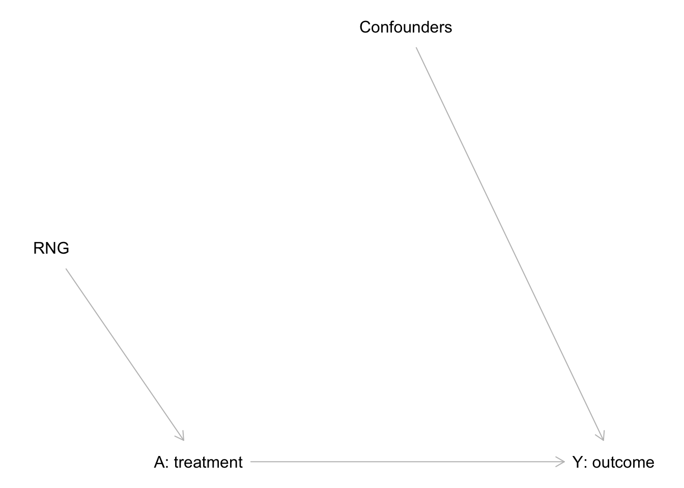
Backdoor vs. other noncausal paths
Key idea: randomization cuts off (removes) ALL backdoor paths (noncausal paths that start by pointing to treatment).
This includes backdoor paths that could only be blocked with unmeasured variables!
But randomization doesn’t do anything to other noncausal paths leading from treatment.
Noncompliance and blinding
Suppose that a randomized experiment is evaluating the effect of a new medication versus an existing medication for cholesterol levels.
Question: For the following 3 considerations, discuss with your group: what would happen to the generic RCT causal diagram if each of the following were a concern? Draw an updated diagram for each consideration. (Handle each consideration separately.)
What if subjects don’t comply with the treatment they were randomly assigned?
What if subjects know what treatment they were assigned?
What if study investigators know what treatment group a subject was assigned to?
We mentioned earlier that a randomized experiment randomizes units to treatment conditions. How exactly this randomization is done can vary and can have important consequences.
From the figure and the text in the figure legend, what seems to be the difference between these randomization methods?
What does the figure do well to communicate differences between randomization methods? What could be improved?
After reading the “Details about randomization methods” section below, how would you recommend updating the figure to be more clear?
Details about randomization methods
Complete randomization:
A method in which assignment to treatment group as well as treatment order is randomized. The number of units assigned to each treatment group can be controlled.
Example: If we want to have 100 treated units and 200 control units, we create a random sequence of 100 1’s and 200 0’s to perform this randomization.
Block randomization (related to stratified randomization)
Form “blocks” (groups) of units that are identical (or as close as possible)
Within each block randomize each unit to a treatment group and randomize the order of the units
Example: We want to ensure that age (young, old) and prior experience (low, high) are balanced between the treatment and control groups. These two variables define 4 blocks or strata:
Age = young, prior exp = low: 6 units
Randomization: 0 0 1 1 0 1
Age = young, prior exp = high: 8 units
Randomization: 1 1 0 1 0 0 0 1
Age = old, prior exp = low: 4 units
Randomization: 1 0 0 1
Age = old, prior exp = high: 6 units
Randomization: 1 1 0 0 1 0
Checking the balance of a randomization
After obtaining a random assignment, it is important to check that the treatment groups are balanced in terms of variables that affect the outcome.
The cobalt package provides a convenient way to do this with the bal.tab() function:
set.seed(451)n <-1000sim_data <-tibble(A =sample(c(rep(0, n/2), rep(1, n/2))),C1 =rnorm(n, mean =2, sd =1),C2 =rnorm(n, mean =2, sd =1),mean_Y = A + C1 + C2,noise_Y =rnorm(n, mean =0, sd =5),Y = mean_Y + noise_Y)# The bal.tab() function from the cobalt package# automatically computes balance statistics# Continuous variables: standardized mean differences (difference in means divided by a pooled estimate of the std dev from both groups)# Binary variables: raw differences in proportionbal.tab(A ~ C1 + C2, data = sim_data, s.d.denom ="pooled")
Balance Measures
      Type Diff.Un
C1 Contin.  0.0341
C2 Contin.  0.0464

Sample sizes
    Control Treated
All     500     500
Precision variables
Question: Based on the simulation code below, what causal graph represents the data-generating process? What can you infer is the causal effect of A on Y?
set.seed(451)n <-1000sim_data <-tibble(A =sample(c(rep(0, n/2), rep(1, n/2))),C1 =rnorm(n, mean =2, sd =1),C2 =rnorm(n, mean =2, sd =1),C3 =rnorm(n, mean =2, sd =1),C4 =rnorm(n, mean =2, sd =1),mean_Y =5*A + C1 + C2 + C3 + C4,noise_Y =rnorm(n, mean =0, sd =5),Y = mean_Y + noise_Y)
The simulation below uses the same RCT data-generating process as above. It conducts 1000 of these RCTs and fits two different models. Read through this code to understand what is being done. Then work on the exercises beneath the code chunk.
# Helper function to organize linear regression model outputtidy_model_output <-function(mod, type) {tidy(mod, conf.int =TRUE, conf.level =0.95) %>%mutate(model_type = type) %>%filter(term=="A")}set.seed(451)sim_results <-replicate(1000, { n <-1000 sim_data <-tibble(A =sample(c(rep(0, n/2), rep(1, n/2))),C1 =rnorm(n, mean =2, sd =1),C2 =rnorm(n, mean =2, sd =1),C3 =rnorm(n, mean =2, sd =1),C4 =rnorm(n, mean =2, sd =1),mean_Y =5*A + C1 + C2 + C3 + C4,noise_Y =rnorm(n, mean =0, sd =5),Y = mean_Y + noise_Y )# Fit a linear regression model with only A as a predictor mod_unadj <-lm(Y ~ A, data = sim_data)# Fit a model with C1 to C4 as covariates mod_adj <-lm(Y ~ A + C1 + C2 + C3 + C4, data = sim_data)# Store results for the coefficient on A in a data framebind_rows(tidy_model_output(mod_unadj, type ="unadjusted"),tidy_model_output(mod_adj, type ="adjusted") )}, simplify =FALSE)sim_results <-bind_rows(sim_results)# Peek at the simulation results data framehead(sim_results)
# A tibble: 6 × 8
  term  estimate std.error statistic  p.value conf.low conf.high model_type
  <chr>    <dbl>     <dbl>     <dbl>    <dbl>    <dbl>     <dbl> <chr>
1 A         5.09     0.335      15.2 3.77e-47     4.43      5.75 unadjusted
2 A         5.13     0.315      16.3 4.69e-53     4.51      5.75 adjusted
3 A         5.13     0.336      15.2 2.73e-47     4.47      5.79 unadjusted
4 A         5.26     0.307      17.1 6.20e-58     4.65      5.86 adjusted
5 A         5.28     0.342      15.4 2.98e-48     4.61      5.95 unadjusted
6 A         5.12     0.312      16.4 1.09e-53     4.51      5.74 adjusted
Exercise: Create visualizations that compare the estimated causal effect and the uncertainty in that estimate between model types. What do you learn from these plots?
Exercise: In the simulation above, we explored adjusting for the direct causes of outcome Y. Suppose that we weren’t able to measure the direct causes (C1 to C4), but that we only had measures of proxies. (For example, “willingness to volunteer” might be a direct cause of an outcome, but we can only measure number of volunteer hours in the past month.) How might we adapt the simulation setup above to investigate how adjusting for proxies changes the comparison between the unadjusted and adjusted models?