library(tidyverse)
library(sandwich)
library(lmtest)
library(broom)

syg <- read_csv("~/Desktop/teaching/STAT451/data/its_synthcont_supplementary_data/syg_dat2.csv")

# Some data cleaning
syg <- syg %>%
    mutate(
        hom_rate = hom*100000/stdpop,
        time_c = time - 82 # Create centered version of time (IMPORTANT!)
    ) %>%
    select(-`...1`, -stdpop2) %>%
    rename(post = Effective, treated = case) %>%
    mutate(zone = case_when(
        post==0 & treated==0 ~ "Controls (pre)",
        post==0 & treated==1 ~ "Treated (pre)",
        post==1 & treated==0 ~ "Controls (post)",
        post==1 & treated==1 ~ "Treated (post)",
))Event study/interrupted time series designs and synthetic control
You can download a template file for this activity here.
Discussion
Slides for a discussion on the synthetic control method are here.
What are interrupted time series designs?
Interrupted times series (event studies) are perhaps the most natural study design for assessing causal effects:
- An event happens—compare what was happening before and after the event (hence the name “event study”)
- To frame it another way, we have a time series of the outcome evolving over time, an event happens, and that time series gets interrupted and changes after the event (hence the name “interrupted time series” (ITS))
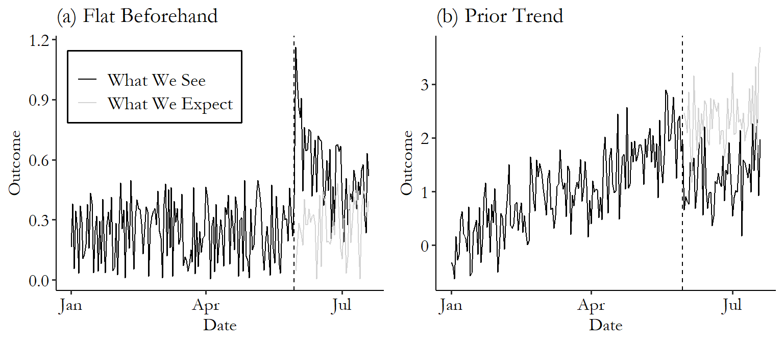
Autocorrelation
Autocorrelation is an important statistical consideration when looking at ITS data: the outcome at a given time will almost certainly be correlated with the outcome at previous times.
- We need to account for this autocorrelation when estimating standard errors.
- If we don’t, we will likely underestimate standard errors.
- Correlation between cases reduces the effective sample size. If we have two observations that are highly correlated, we don’t really have two full units of information.
- In the most extreme case, we could take our dataset and just copy and paste it twice. We really only have one dataset’s worth of information even if we have twice as many cases.
History bias
An ITS design is rather similar to a regression discontinuity design with time as the running variable.
But when time is the running variable, an important source of bias is relevant: history bias.
- This refers to the fact that other events that influence the outcome can happen at (or around) the same time as the intervention.
- e.g., If the intervention is a new law, confounding events could include other laws that were introduced at roughly the same time or major economic events (like recessions).
- We need to think carefully about the data context
Comparative interrupted time series
A comparative interrupted time series design is an extension of the ITS that not only looks at the outcome time series in the treatment unit(s) but also in control units.
- Control units will not have experienced the intervention during the time period under study but SHOULD have experienced the confounding events.
One example:
Wow this is a pretty compelling comparative interrupted time series graph. Don't usually see such a stark effect. https://t.co/VCPLwUrXby
— Elizabeth Stuart (@Lizstuartdc) September 6, 2020
Another example: Figure 3 from the article Can synthetic controls improve causal inference in interrupted time series evaluations of public health interventions?
Modeling for CITS
Exercise: A general model for the trends in outcomes before and after the intervention in treatment and control units is given below. (This model doesn’t adjust for any seasonal periodicity in the outcome. Accounting for seasonality doesn’t change the fundamental insights from this exercise, but we’ll look at modeling seasonality next time.)
Variables:
post: 1 if observation is in the post-intervention time period, 0 if in pre-periodtreated: 1 if observation is from a treated unit, 0 if controlT: time (will be centered at the time of intervention \(T_0\))
\[ E[Y \mid \text{post,treated},T] = \beta_0 + \beta_1\text{post} + \beta_2\text{treated} + \beta_3(T-T_0) + \beta_4\text{post}\times\text{treated} + \beta_5\text{treated}\times(T-T_0) + \beta_6\text{post}\times (T-T_0) + \beta_7\text{post}\times\text{treated}\times (T-T_0) \]
Write out the model formulas for \(Y\) as a function of (centered) time (\(T-T_0\)) in the treated and controls units, in the pre-intervention and post-intervention periods. Draw a diagram showing the 4 trends. Label slopes and intercepts.
- What coefficient(s) govern how similar the treatment and control units are in the pre-intervention time period?
- What coefficient(s) govern the discontinuity in the trend at \(T_0\)?
Selection of control units
Our upcoming data example: what was the effect of Florida’s 2005 Stand Your Ground law on homicide rates and homicide rates by firearm?
- Control states: New York, New Jersey, Ohio, and Virginia
Selection of control units:
- In the CITS design, the choice of what control units to use can be somewhat subjective:
- Choose units that don’t experience the intervention but do experience the hypothesized confounding event and have “similar” characteristics to the treated units
The synthetic control method
- The synthetic control method is a data-driven control group selection procedure.
- We have a set of control units (also called the control pool or donor pool)
- Want to find a set of positive weights that sum to 1 that reweight the control units to create a synthetic version of the treatment unit had they not received the intervention
- This synthetic version of the treatment unit is called the synthetic control.
- Essentially, we are reweighting the controls in the pool to create a synthetic control as similar as possible to the treatment unit in the pre-intervention time period.
- Finding weights allows for control selection because some weights are almost zero.
What does “as similar as possible on key characteristics” mean? The analyst can choose to have similarity determined by:
- Pre-intervention covariates
- Factors that are constant over time (like geography)
- Factors that vary over time (like demographics) and are measured before the intervention happens
- Generally each of these factors is summarized over a time span
- e.g., Have yearly unemployment rate in each of the 5 years from 2000-2004. Compute the mean unemployment rate over this time span—do this in the treated units and in the control units.
- Pre-intervention outcomes
- Can create up to M different linear combinations of pre-intervention outcomes where M is at most the number of pre-intervention time periods
- Commonly, the average outcome over the pre-intervention time span is used.
Data exploration
We will be looking at data from the article Can synthetic controls improve causal inference in interrupted time series evaluations of public health interventions?
Research question: What was the effect of Florida’s 2005 Stand Your Ground law on homicide rates and homicide rates by firearm?
Codebook: 16 years of monthly data from 1999-2014
yearandmonthhom,suic,fhom,fsuic: Number of homicide, suicide, homicide by firearm, suicide by firearm deathstime: time index from 1 to 192 (1 = Jan 1999, 192 = Dec 2014)post: 1 if SYG law is in effect in Florida and 0 otherwise. (Indicator for the post intervention time period, which is Oct 2005 and beyond)case: 1 if Florida (treatment state) and 0 if control state (New York, New Jersey, Ohio, Virginia)
Comparative interrupted time series
Recall the general comparative interrupted time series model:
\[ E[Y \mid \text{post,treated},T] = \beta_0 + \beta_1\text{post} + \beta_2\text{treated} + \beta_3(T-T_0) + \beta_4\text{post}\times\text{treated} + \beta_5\text{treated}\times(T-T_0) + \beta_6\text{post}\times (T-T_0) + \beta_7\text{post}\times\text{treated}\times (T-T_0) \]
It is helpful to break down the time trend into 4 components:
- Pre-intervention period:
- Controls: \(\beta_0 + \beta_3(T-T_0)\)
- Treated: \((\beta_0+\beta_2) + (\beta_3+\beta_5)(T-T_0)\)
- Post-intervention period:
- Controls: \((\beta_0+\beta_1) + (\beta_3+\beta_6)(T-T_0)\)
- Treated: \((\beta_0+\beta_1+\beta_2+\beta_4) + (\beta_3+\beta_5+\beta_6+\beta_7)(T-T_0)\)
- For the controls, the pre- to post-intervention jump is \(\beta_1\).
- \(\beta_1\) captures the impact of the confounding event(s).
- For the treated, the pre- to post-intervention jump is \(\beta_1+\beta_4\).
- \(\beta_1+\beta_4\) captures the impact of the confounding event(s) AND the intervention of interest.
- So to remove the impact of the confounding event(s) and just leave the intervention effect, we subtract off \(\beta_1\).
- \(\beta_4\) represents the intervention effect.
Initial data visualization
ggplot(syg, aes(x = time, y = hom_rate, color = zone)) +
    geom_point() +
    geom_smooth(se = FALSE) +
    theme_classic() +
    geom_vline(xintercept = 81.5) +
    scale_color_manual(values = c("Controls (pre)" = "lightblue", "Controls (post)" = "steelblue", "Treated (pre)" = "peachpuff", "Treated (post)" = "darkorange"))

ggplot(syg, aes(x = time, y = hom_rate, color = zone)) +
    geom_point() +
    geom_smooth(method = "lm", se = FALSE) +
    theme_classic() +
    geom_vline(xintercept = 81.5) +
    scale_color_manual(values = c("Controls (pre)" = "lightblue", "Controls (post)" = "steelblue", "Treated (pre)" = "peachpuff", "Treated (post)" = "darkorange"))
Modeling
The code provided in the supplement of the paper provides an interaction model that is not a full interaction model. We will explore theirs in cits_mod1 and our own full interaction model. Based on our visualizations above, is a full interaction model appropriate?
cits_mod1 <- glm(hom_rate ~ post*treated + time_c*treated + factor(month), family = gaussian(link = "log"), data = syg)
cits_mod2 <- glm(hom_rate ~ post*time_c*treated + factor(month), family = gaussian(link = "log"), data = syg)
Let’s look at a residual plot to evaluate the quality of
residual_plot <- function(mod) {
    mod_output <- augment(mod)
    ggplot(mod_output, aes(x = time_c, y = .resid)) +
        geom_point() +
        geom_smooth(se = FALSE) +
        theme_classic() +
        geom_hline(yintercept = 0)
}

residual_plot(cits_mod1) + labs(title = "Not full interaction + month effects")
residual_plot(cits_mod2) + labs(title = "Full interaction + month effects")
predicted_plot <- function(mod) {
mod_output <- augment(mod, newdata = syg, type.predict = "response")
ggplot(mod_output, aes(x = time, y = hom_rate, color = zone)) +
geom_point() +
geom_line(aes(x = time, y = .fitted)) +
geom_smooth(method = "lm", se = FALSE) +
theme_classic() +
geom_vline(xintercept = 81.5) +
scale_color_manual(values = c("Controls (pre)" = "lightblue", "Controls (post)" = "steelblue", "Treated (pre)" = "peachpuff", "Treated (post)" = "darkorange"))
}
predicted_plot(cits_mod1) + labs(title = "Not full interaction + month effects")
predicted_plot(cits_mod2) + labs(title = "Full interaction + month effects")Let’s look at the results (just for the coefficient estimates). We’ll account for the autocorrelation in the data to adjust standard errors next.
tidy(cits_mod1, exponentiate = TRUE) %>% select(-std.error)
tidy(cits_mod2, exponentiate = TRUE) %>% select(-std.error)
Adjusting the standard errors for autocorrelation
Time series data tend to exhibit autoregressive behavior. For example, an outcome in 2005 is likely a function of its 2004, 2003, 2002, …, EARLIEST_RELEVANT_YEAR values. 2005 - EARLIEST_RELEVANT_YEAR is called the order of a an autoregressive process.
We can use the partial autocorrelation function (PACF) to get a sense of what this order could be for a given time series.
- The PACF at a given lag L tells us how correlated a time series is with a version of itself lagged by L time periods.
- For an order \(p\) autoregressive process, the PACF drops to effectively zero (stays within the dashed confidence band) at lags greater than \(p\).
syg_subs <- syg %>% filter(treated==1)
pacf(syg_subs$hom_rate, na.action = na.pass)
The coeftest() function in the lmtest package implements Newey-West standard errors which account for this autocorrelation (and heteroskedasticity). We specify the order of the autoregressive process in the lag argument:
coeftest(cits_mod1, vcov = NeweyWest, lag = 3)
coeftest(cits_mod2, vcov = NeweyWest, lag = 3)
Synthetic control
Now let’s explore the synthetic control methodology.
Run the following commands in the Console to install packages:
install.packages(c("devtools", "Synth"))
devtools::install_github("bcastanho/SCtools")
Read in data, load packages, data cleaning.
library(Synth)
library(SCtools)

syg_full <- read_csv("~/Desktop/teaching/STAT451/data/its_synthcont_supplementary_data/syg_dat3.csv")

syg_full_clean <- syg_full %>%
    rename(treated = Case) %>%
    select(-`...1`, -Year.month,) %>%
    mutate(across(!State, as.numeric))

syg_full_clean <- syg_full_clean %>%
    filter(!is.na(State.Code)) %>%
    mutate(
        HomicideRates = homicide_total*100000/Population,
        Firearm.suicides = Firearm.suicides*100000/Population,
        Suicides = Suicides*100000/Population
    )

# Force the data to be of the data.frame class (rather than tbl)
# Weird errors will result otherwise!
syg_full_clean <- as.data.frame(syg_full_clean)
Data preparation
The dataprep() function in the Synth package prepares the data for the optimization process that gives us good weights that make the synthetic control as similar as possible to the treated unit before the intervention.
sc_prep <- dataprep(
    foo = syg_full_clean,
    predictors = c("Unemployment_adj","Firearm.suicides", "Suicides"),
    predictors.op = "mean",
    time.predictors.prior = c(1:81),
    special.predictors = list(
        # Format: list(VARNAME, PERIOD, AVERAGING METHOD)
        # Yearly data
        list("Paid.Hunting.License.Holders", seq(1,81,12), "mean"),
        list("Annual.Burglary.Rate", seq(1,81,12), "mean"),
        list("Personal.income.per.capita..dollars.", seq(1,81,12), "mean"),
        list("Annual.robbery.rate", seq(1,81,12), "mean"),
        list("Annual.incarceration.rate", seq(1,81,12), "mean"),
        list("Num_pop_over15", seq(1,81,12), "mean"),
        list("Proportion.of.population.hispanic", seq(1,81,12), "mean"),
        list("Proportion.of.population.AA.or.B", seq(1,81,12), "mean"),
        list("Percentage.4.year.bachelors.or.above..25.years.old.and.over", seq(1,81,12), "mean"),
        list("Proportion.of.15.24", seq(1,81,12), "mean"),
        list("Gallons.of.ethanol", seq(1,81,12), "mean"),
        list("Num_pov", seq(1,81,12), "mean"),
        # Less than yearly (e.g., every 4 years)
        list("Number.of.sworn.officers.per.1.000.U.S..residents", seq(13,81,48), "mean"), # every 4 years: 2000, 2004
        list("Percentage.of.republican.voters.in.presidential.election", seq(13,81,48), "mean"), # every 4 years: 2000, 2004
        list("Density", seq(13,81,120), "mean"), # every decade starting 2000
        list("MSA", seq(13,81,120), "mean"), # every decade starting 2000
        list("prop_urban", seq(13,81,120), "mean") # every decade starting 2000
    ),
    dependent = "HomicideRates", # outcome variable
    unit.variable = "State.Code", # variable identifying unit number
    unit.names.variable = "State", # variable identifying unit name
    time.variable = "time", # time variable
    treatment.identifier = "Florida", # The unit name for the treatment unit
    controls.identifier = c("Arkansas", "Connecticut", "Delaware", "Hawaii", "Iowa", "Maine", "Maryland", "Massachusetts", "Nebraska", "New Jersey", "New York", "North Dakota", "Ohio", "Rhode Island", "Wyoming"), # The unit names for the controls
    time.optimize.ssr = 1:81, # Time period over which to optimize similarity of treated and controls
    time.plot = c(1:192) # Time period for making the time series plot
)
Running the synthetic control method
# Run the synthetic control method
synth_out <- synth(sc_prep)
Inspecting the results
The synth.tab() function in the Synth package extracts some useful tables. We can first look at the weight assigned to each control unit by accessing the tab.w component:
sc_tables <- synth.tab(dataprep.res = sc_prep, synth.res = synth_out)

# What was the weight for each control unit?
sc_tables$tab.w
We can take a look at the relative importance of each covariate by accessing the tab.v component. (Here, the variable names are so long that it’s easier to enter sc_tables$tab.v %>% View() in the Console.)
sc_tables$tab.vThe tab.pred component gives a table comparing pre-treatment covariate values for the treated unit (column 1), the synthetic control unit (column 2), and all the units in the sample (column 3). (Enter sc_tables$tab.pred %>% View() in the Console for easier viewing.)
sc_tables$tab.predVisualizing the results
We can manually plot the treated unit and synthetic control time series.
# Save treatment and synthetic control for subsequent data analysis & figures
df_paths <- tibble(
    time = 1:192,
    treated = as.numeric(sc_prep$Y1plot),
    synth_control = as.numeric(sc_prep$Y0plot %*% synth_out$solution.w) # Note that %*% is the matrix multiplication operator in R
)
ggplot(df_paths, aes(x = time, y = treated)) +
    geom_line(color = "black") +
    geom_line(aes(x = time, y = synth_control), color = "gray40", lty = "dashed") +
    theme_classic() +
    geom_vline(xintercept = 81.5, color = "red")

# We can also plot the time series using path.plot() in the Synth package
path.plot(
    synth.res = synth_out,
    dataprep.res = sc_prep,
    Ylab = "Homicide rate",
    Xlab = "year",
    Legend = c("Florida", "Synthetic Florida"),
    tr.intake = 81.5
)
We can also plot the difference (gap) between these series:
# Manually with ggplot
ggplot(df_paths, aes(x = time, y = treated-synth_control)) +
    geom_line(color = "black") +
    theme_classic() +
    geom_vline(xintercept = 81.5, color = "red")

# Using gaps.plot() in the Synth package
gaps.plot(synth_out, sc_prep, tr.intake = 81.5)
Placebo tests and statistical inference
We can generate statistical inferential measures (p-values) for the synthetic control effect with placebo tests. We will have each control unit serve as the treated unit in turn. For each of these iterations, we’ll run the synthetic control method as normal.
The generate.placebos() function in the SCtools package implements these placebo tests.
system.time({
placebos <- generate.placebos(sc_prep, synth_out)
})
The SCtools::plot_placebos() function plots the following gap:
actual time series for unit i - synthetic control time series for unit i
This gap is shown for all units (our actual treated unit of Florida and the 15 control states).
But the function has a bug in which the legend labels are switched, so we will use the following custom plotting function:
plot_placebos_custom <- function (tdf = tdf, xlab = NULL, ylab = NULL, title = NULL, ...) {
    year <- cont <- id <- Y1 <- synthetic.Y1 <- NULL
    if (!is_tdf(tdf)) {
        stop("Please pass a valid `tdf` object the tdf argument.\nThese are generated by the `generate.placebos` function.")
    }
    n <- tdf$n
    t1 <- unique(tdf$df$year)[which(tdf$df$year == tdf$t1) -
        1]
    tr <- tdf$tr
    names.and.numbers <- tdf$names.and.numbers
    treated.name <- as.character(tdf$treated.name)
    df.plot <- NULL
    for (i in 1:n) {
        a <- cbind(tdf$df$year, tdf$df[, i], tdf$df[, n + i], i)
        df.plot <- rbind(df.plot, a)
    }
    df.plot <- data.frame(df.plot)
    colnames(df.plot) <- c("year", "cont", "tr", "id")

    df.plot <- bind_rows(
        df.plot %>% mutate(id = as.character(id)),
        data.frame(year = tdf$df$year, cont = tdf$df$synthetic.Y1, tr = tdf$df$Y1, id = "treated")
    ) %>%
        mutate(treated = id=="treated")
    p.gaps <- ggplot(data = data.frame(df.plot), aes(x = year,
        y = (tr - cont))) +
        geom_line(aes(group = id, color = treated)) +
        geom_vline(xintercept = t1, linetype = "dotted") +
        geom_hline(yintercept = 0, linetype = "dashed") +
        ylim(c(1.5 * min(c(min(tdf$df$Y1 - tdf$df$synthetic.Y1), min(df.plot$tr - df.plot$cont))),
        1.5 * max(c(max(tdf$df$Y1 - tdf$df$synthetic.Y1), max(df.plot$tr -
            df.plot$cont))))) +
        labs(y = ylab, x = xlab, title = title) +
        scale_color_manual(
            values = c("FALSE" = "gray80", "TRUE" = "black"),
            labels = c("Control units", tdf$treated.name),
            guide = guide_legend(NULL)
        ) +
        theme(
            panel.background = element_blank(),
            panel.grid.major = element_blank(),
            panel.grid.minor = element_blank(),
            axis.line.x = element_line(colour = "black"),
            axis.line.y = element_line(colour = "black"),
            legend.key = element_blank(),
            axis.text.x = element_text(colour = "black"),
            axis.text.y = element_text(colour = "black"),
            legend.position = "bottom"
        )
    return(p.gaps)
}plot_placebos(placebos)
plot_placebos_custom(placebos)SCtools::mspe_plot() shows the post MSPE/pre MSPE ratio for all units serving as the “treated” unit. From this we get a sense of how extreme the ratio is for the treated unit.
mspe_plot(placebos, plot.hist = TRUE)SCtools::mspe_plot() shows the MSPE ratios for every unit and computes the p-value as the proportion of units with an MSPE ratio as or more extreme than Florida’s:
mspe_test(placebos)