Topic 8 Splines
8.1 Discussion
Goal: model nonlinear trends in data
- We’ve seen that KNN regression can learn nonlinear functions.
- We’ll see that splines can do the same.
Splines are a means of performing variable transformations
- Let’s say that \(y\) and \(x\) are related with a logarithmic trend: \(y = \log(x) + \varepsilon\).
- We transform \(x\) to make a new variable called \(x_{\text{new}}\), with \(x_{\text{new}}=\log(x)\).
- Then the relationship between \(y\) and \(x_{\text{new}}\) will be linear.
- We do the same thing with splines.
- But with splines, we create multiple transformed variables.
How does the ns() function work?
- If I want to split my quantitative predictor into \(r\) regions, I’ll make \(r-1\) cuts (\(r-1\) knots).
- Usually the knots are placed at regularly spaced quantiles (e.g. 25, 50, 75 for 3 knots)
- This number of regions \(r\) is called the degrees of freedom (
df) parameter. This is a tuning parameter of splines. - Using only the quantitative predictor and
dfas inputs,ns()knows:- The exact number of transformation functions to use (this number is equal to
df) - The exact formulas of the transformation functions (they’re polynomial functions)
- The exact number of transformation functions to use (this number is equal to
- How does R know the exact formulas of the transformation functions?
- Calculus and linear algebra
Example
Suppose we break our predictor variable into 3 regions (2 knots).
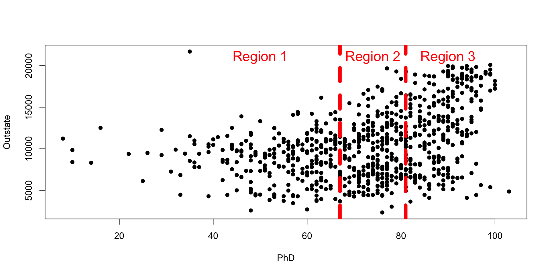
- We want to find coefficients for the following polynomials in the 3 regions:
- Region 1: \(a_0 + a_1x + a_2x^2 + a_3x^3\)
- Region 2: \(a_4 + a_5x + a_6x^2 + a_7x^3\)
- Region 3: \(a_8 + a_9x + a_{10}x^2 + a_{11}x^3\)
- We need to make sure that, at the knots, the polynomials are continuous and have continuous first and second derivatives.
- We also make sure that at the minimum and maximum \(x\), the function is linear.
When you run ns(), R doesn’t give these functions directly but does give a mathematically “nice” representation of those 3 functions:
x <- sort(college_subs$PhD)
spline_terms <- ns(x, df = 3)
matplot(x, spline_terms, type = "l", lty = "solid", lwd = 6, xlab = "PhD", ylab = "Spline function", cex.axis = 1.5, cex.lab = 1.5)
legend("topleft", legend = paste("Spline function", 1:3), col = 1:3, lty = "solid", bty = "n", cex = 1.5)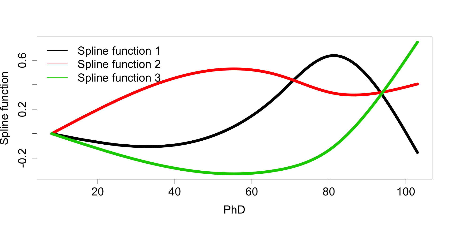
(If you’ve taken linear algebra, this is a basis representation.)
To use these transformation functions, we plug in the original PhD’s and get out 3 transformed versions of PhD. You can think of these transformations as corresponding to the polynomials in the 3 regions.
Some predictions made from splines
- Red line: linear fit
- Blue line: LOESS fit
- Orange line: spline fit with degrees of freedom (regions) = 4 (3 knots)
- Green line: spline fit with degrees of freedom (regions) = 20 (19 knots)
library(gridExtra)
p1 <- ggplot(college_subs, aes(x = PhD, y = Outstate)) +
    geom_point() +
    geom_smooth(method = "lm", se = FALSE, col = "red", lwd = 3) +
    geom_smooth(method = "loess", se = FALSE, col = "blue", lwd = 3)
p2 <- p1 + geom_smooth(method = "lm", formula = y ~ splines::ns(x, df = 4), se = FALSE, col = "orange", lwd = 3)
p3 <- p2 + geom_smooth(method = "lm", formula = y ~ splines::ns(x, df = 20), se = FALSE, col = "limegreen", lwd = 3)
grid.arrange(p1, p2, p3, ncol = 3)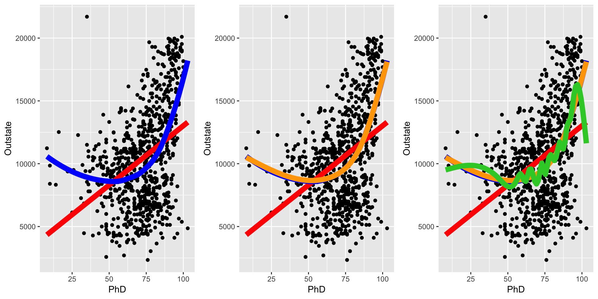
8.2 Exercises
You can download a template RMarkdown file to start from here.
We’ll explore KNN regression and modeling with splines using the College dataset in the ISLR package (associated with our optional textbook). You’ll need to install the splines package as we’ll be using it subsequently.
Our goal will be to build a model that predicts out-of-state tuition (Outstate).
# Load packages and data
library(dplyr)
library(ggplot2)
library(caret)
library(ISLR)
data(College)

# Examine the data codebook
?College
- Get to know the
Collegedata- Peek at the first few rows.
- How many colleges are in the dataset?
- How many possible predictors of
Outstateare there? Is Mac one of the colleges in this data? The code to check this quickly is below:
"Macalester College" %in% rownames(College)If you are curious about working with strings in R, you might check out the
stringrpackage. Example code is below:library(stringr) rownames(College)[str_detect(rownames(College), "Mac")] rownames(College)[str_detect(rownames(College), "Olaf")]
We’ll actually work with a subset of the predictors for the rest of the exercises:
college_subs <- College %>%
    mutate(adm_rate = Accept/Apps) %>%
    select(Outstate, Private, Top10perc, Room.Board, PhD, S.F.Ratio, perc.alumni, Expend, Grad.Rate, adm_rate)
- Baseline parametric vs. nonparametric
(Throughout, includeset.seed(2019)in each code chunk just before you usetrain().)- Fit a parametric ordinary least squares (OLS) model of
Outstateas a function of all predictors, and use 10-fold cross-validation to estimate the test error of this model. Use the straight average of the RMSE column. We’ll fit nonparametric KNN models to this data and compare performance. The code below fits KNN models for \(k = 1,6,\ldots,96\). (
seq(1,100,5)generates a regular sequence from 1 to 100 jumping by 5.)set.seed(2019) knn_mod_allpred <- train( Outstate ~ ., data = college_subs, method = "knn", tuneGrid = data.frame(k = seq(1,100,5)), trControl = trainControl(method = "cv", number = 10), metric = "RMSE", na.action = na.omit )Models
train()ed bycarethave several features in common. We can useplot()on the object resulting fromtrain()to plot test RMSE versus the tuning parameter.
Comment on the shape of this curve and how it is related to the bias-variance tradeoff.plot(knn_mod_allpred)We can also look at estimated test errors and their associated uncertainty with
$results. We can also see the optimal value of the tuning parameter with$bestTune.
How does the best KNN model compare to the OLS model in terms of estimated test error?knn_mod_allpred$results knn_mod_allpred$bestTuneIn machine learning, nonparametric methods tend to suffer from something called the curse of dimensionality. Do some Googling or search our ISLR textbook for this term.
In your own words, explain what the curse of dimensionality is and why KNN suffers from it.
- Fit a parametric ordinary least squares (OLS) model of
- Considering splines
We should first visually explore the data. Make scatterplots of the response versus the following predictors:
PhD,S.F.Ratio,perc.alumni. Add a smooth trend line in blue and a linear trend line in red, as below.ggplot(college_subs, aes(x = ???, y = ???)) + geom_point() + geom_smooth(color = "blue") + geom_smooth(method = "lm", color = "red")- Based on these plots, do you think that a spline model would improve test error?
Let’s fit a spline model “by hand”. Nothing for you to modify here, but step through the code below and make sure you understand the logic of what we’re trying to show.
library(splines)
# Create 4 new spline "variables" (corresponds to 3 knots)
spline_terms_phd <- ns(college_subs$PhD, df = 4)
spline_terms_phd <- as.data.frame(spline_terms_phd)
# Give the variables the names spline1, ..., spline4
colnames(spline_terms_phd) <- paste0("spline", 1:4)
# Add in a new column for the response variable
spline_terms_phd$Outstate <- college_subs$Outstate
# Peek at this new "dataset"
head(spline_terms_phd)
# Fit an OLS model with these spline variables
manual_spline_mod <- lm(Outstate ~ spline1+spline2+spline3+spline4, data = spline_terms_phd)
# Create a dataset with the original PhD variable and the predictions from the spline model
manual_spline_mod_output <- data.frame(
    PhD = college_subs$PhD,
    Outstate = fitted.values(manual_spline_mod)
)
# Overlay the scatterplot with our spline model's predictions
ggplot(college_subs, aes(x = PhD, y = Outstate)) +
    geom_point() +
    geom_smooth(color = "blue") +
    geom_smooth(method = "lm", color = "red") +
    geom_point(data = manual_spline_mod_output, color = "green", aes(x = PhD, y = Outstate))
Note: df in the ns() function stands for “degrees of freedom” and is equal to the number of new spline variables created. df is equal to number of knots plus 1.
- Do splines help?
We can actually use
ns()to create spline variables automatically when we write model formulas. Use the code below to fit a spline model that uses 3 knots for all of the quantitative predictors.set.seed(2019) spline_mod <- train( Outstate ~ Private+ns(Top10perc, df=4)+ns(Room.Board, df=4)+ns(PhD, df=4)+ns(S.F.Ratio, df=4)+ns(perc.alumni, df=4)+ns(Expend, df=4)+ns(Grad.Rate, df=4)+ns(adm_rate, df=4), data = college_subs, method = "lm", trControl = trainControl(method = "cv", number = 10), na.action = na.omit )- Why do we use
method = "lm"? Estimate the test RMSE of
spline_mod. How does this model compare to the original OLS model?
- Splines and the bias-variance tradeoff
What tuning parameter is associated with splines? Add the spline tuning parameter to your BVT diagram from last time.